Image 1 of 1: ‘Blank plot, before adding any mapping aesthetics to ggplot().’
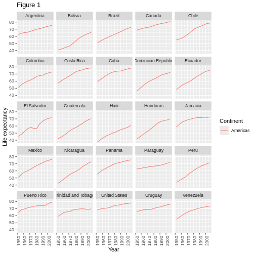
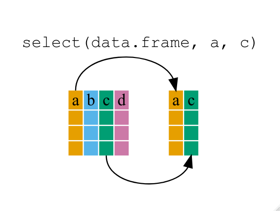
Figure 2
Image 1 of 1: ‘Plotting area with axes for a scatter plot of life expectancy vs GDP, with no data points visible.’
Figure 3
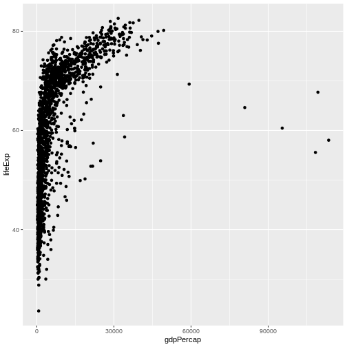
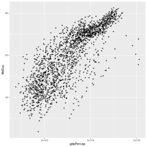
Image 1 of 1: ‘Scatter plot of life expectancy vs GDP per capita, now showing the data points.’
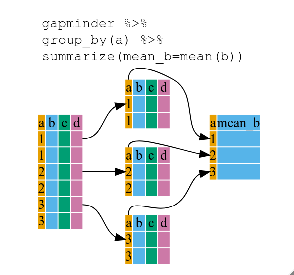
Figure 4
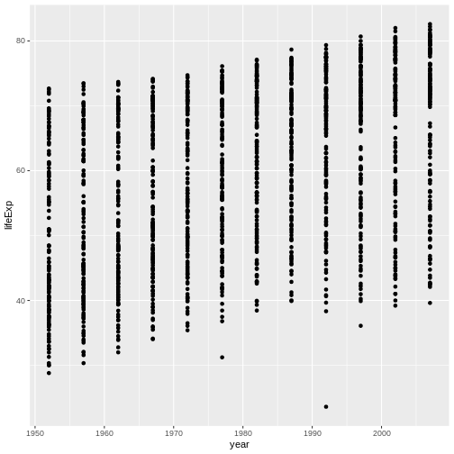
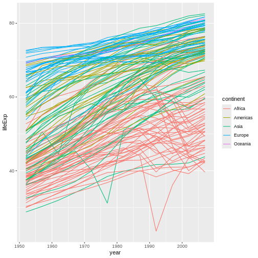
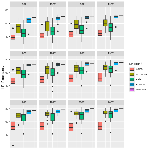
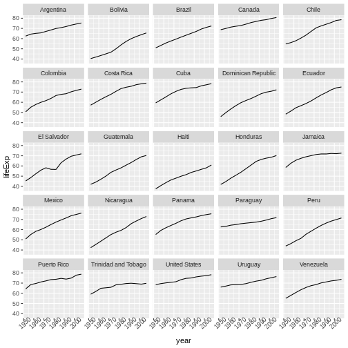
Image 1 of 1: ‘Binned scatterplot of life expectancy versus year showing how life expectancy has increased over time’
Binned scatterplot of life expectancy versus year showing how life
expectancy has increased over time
Figure 5
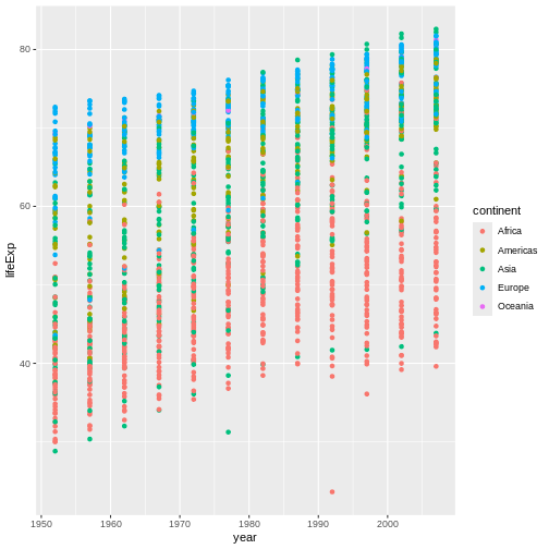
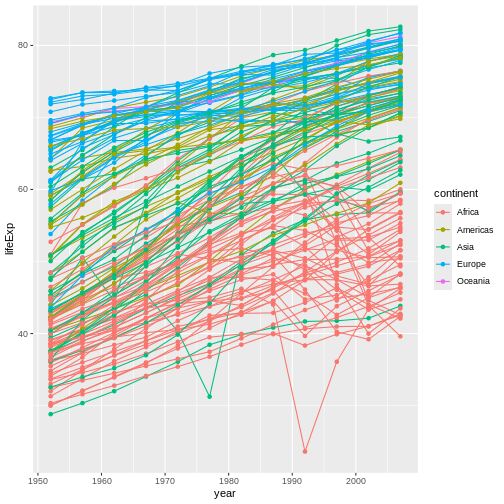
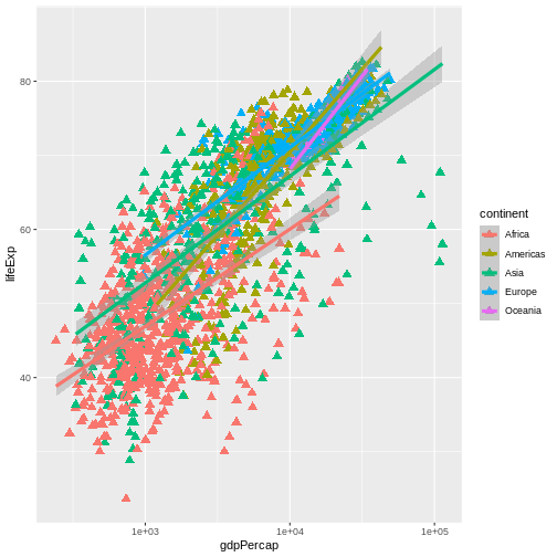
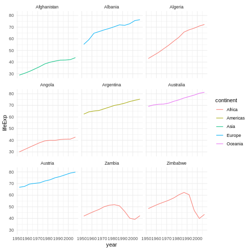
Image 1 of 1: ‘Binned scatterplot of life expectancy vs year with color-coded continents showing value of 'aes' function’
Binned scatterplot of life expectancy vs year with color-coded
continents showing value of ‘aes’ function
Figure 6
Image 1 of 1: ‘[decorative]’
Figure 7
Image 1 of 1: ‘[decorative]’
Figure 8
Image 1 of 1: ‘[decorative]’
Figure 9
Image 1 of 1: ‘[decorative]’
Figure 10
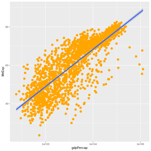
Image 1 of 1: ‘Scatter plot of life expectancy vs GDP per capita with a trend line summarising the relationship between variables. The plot illustrates the possibilities for styling visualisations in ggplot2 with data points enlarged, coloured orange, and displayed without transparency.’
Figure 11
Image 1 of 1: ‘[decorative]’
Figure 12
Image 1 of 1: ‘Scatterplot of GDP vs life expectancy showing logarithmic x-axis data spread’
Scatterplot of GDP vs life expectancy showing logarithmic x-axis data
spread
Figure 13
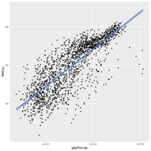
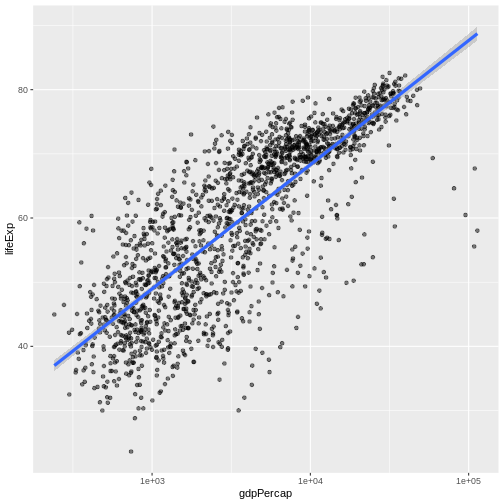
Image 1 of 1: ‘Scatter plot of life expectancy vs GDP per capita with a blue trend line summarising the relationship between variables, and gray shaded area indicating 95% confidence intervals for that trend line.’
Figure 14
Image 1 of 1: ‘Scatter plot of life expectancy vs GDP per capita with a trend line summarising the relationship between variables. The blue trend line is slightly thicker than in the previous figure.’
Figure 15
Image 1 of 1: ‘Scatter plot of life expectancy vs GDP per capita with a trend line summarising the relationship between variables. The plot illustrates the possibilities for styling visualisations in ggplot2 with data points enlarged, coloured orange, and displayed without transparency.’
Image 1 of 1: ‘Screenshot of the New Quarto Document dialogue box in RStudio’
Figure 2
Image 1 of 1: ‘Schematic of the Quarto rendering process’
Figure 3
Image 1 of 1: ‘Icon for turning on and off the visual editing mode in RStudio, which looks like a pair of compasses’
RStudio versions 1.4 and later include visual markdown editing mode.
In visual editing mode, markdown expressions (like
**bold words**) are transformed to the formatted appearance
(bold words) as you type. This mode also includes a
toolbar at the top with basic formatting buttons, similar to what you
might see in common word processing software programs. You can turn
visual editing on and off by pressing the
button in the top right corner of your R Markdown document.
Image 1 of 1: ‘Reproducible produces the same answer: when the same data and same analysis are used. Replicable produces qualitatively similar answers: when different data, the same analysis is used. Robust results show that the work is not dependent on the specificities of the programming language chosen to perform the analysis: when the same data, but a different analysis is used. Generalisable: combining replicable and robust findings allow us to form generalisable results.’
They illustrated the differences between the terms with the following
diagram:
Figure 2
Image 1 of 1: ‘Five practices for clincal epidemiology. 1 Study registration, 2 open data, code and materials, 3 Use of reporting guidelines, 4 pre prints 5 Open access’
Image 1 of 1: ‘Comic: a PhD student sends "FINAL.doc" to their supervisor, but after several increasingly intense and frustrating rounds of comments and revisions they end up with a file named "FINAL_rev.22.comments49.corrections.10.#@$%WHYDIDCOMETOGRADSCHOOL????.doc"’
Image 1 of 1: ‘A diagram demonstrating how a single document grows as the result of sequential changes’
Figure 3
Image 1 of 1: ‘A diagram with one source document that has been modified in two different ways to produce two different versions of the document’
Figure 4
Image 1 of 1: ‘A diagram that shows the merging of two different document versions into one document that contains all of the changes from both versions’
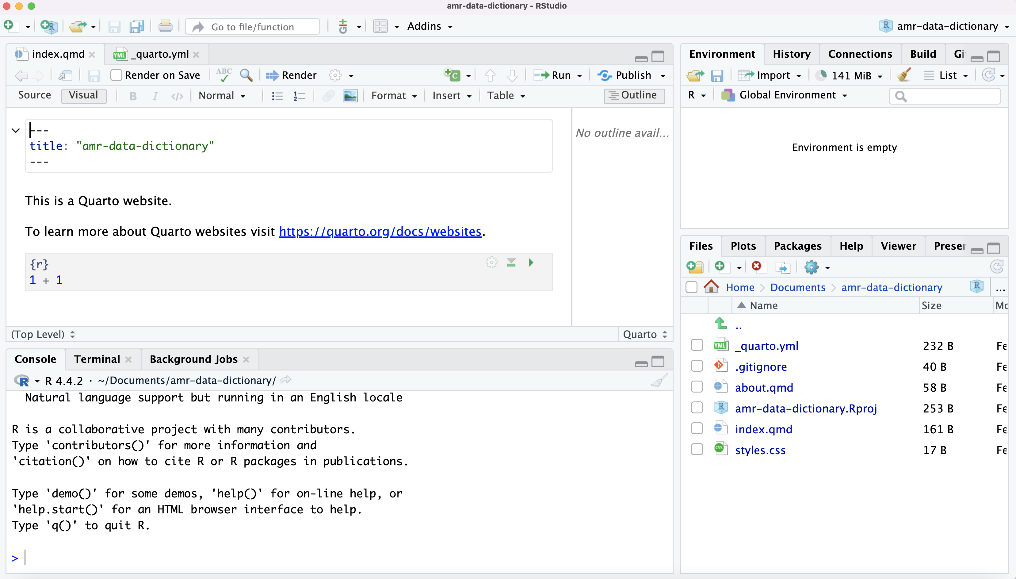
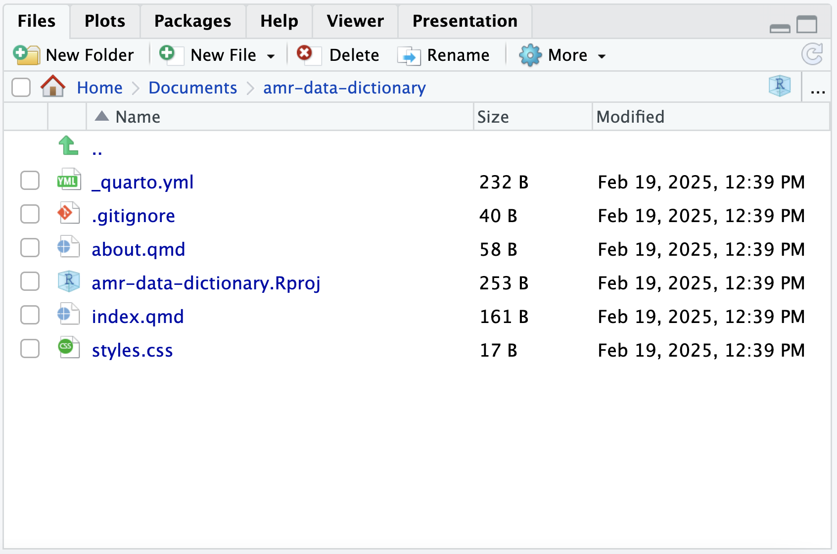
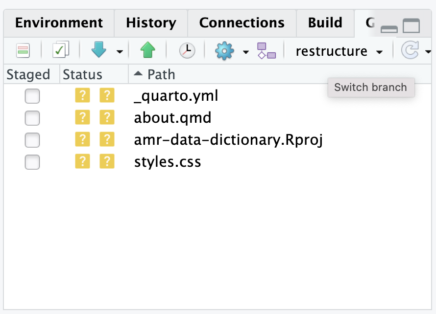
Image 1 of 1: ‘RStudio screenshot showing the current working directory in the Files tab’
Figure 2
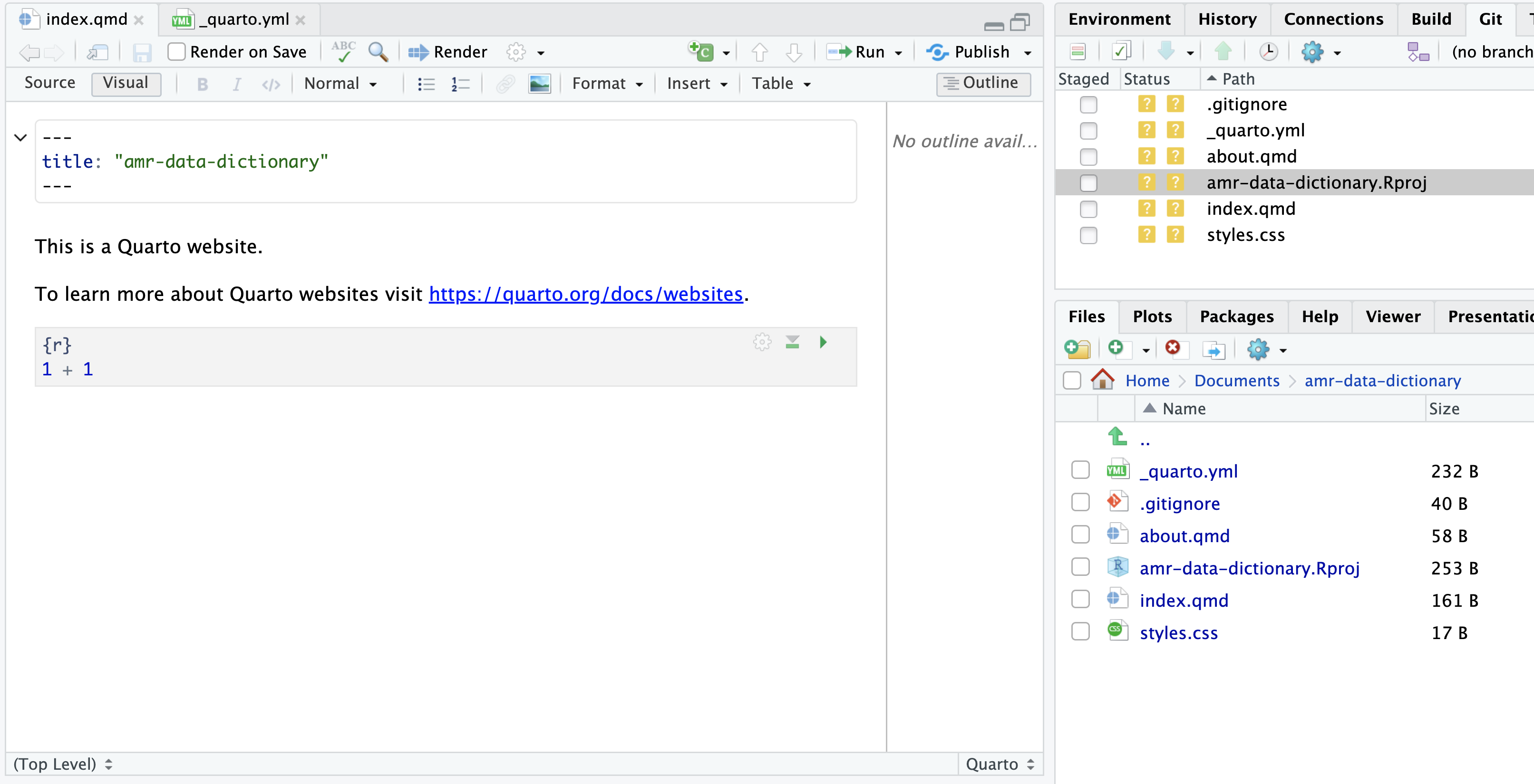
Image 1 of 1: ‘RStudio screenshot showing the default content of index.qmd automatically created.’
Figure 3
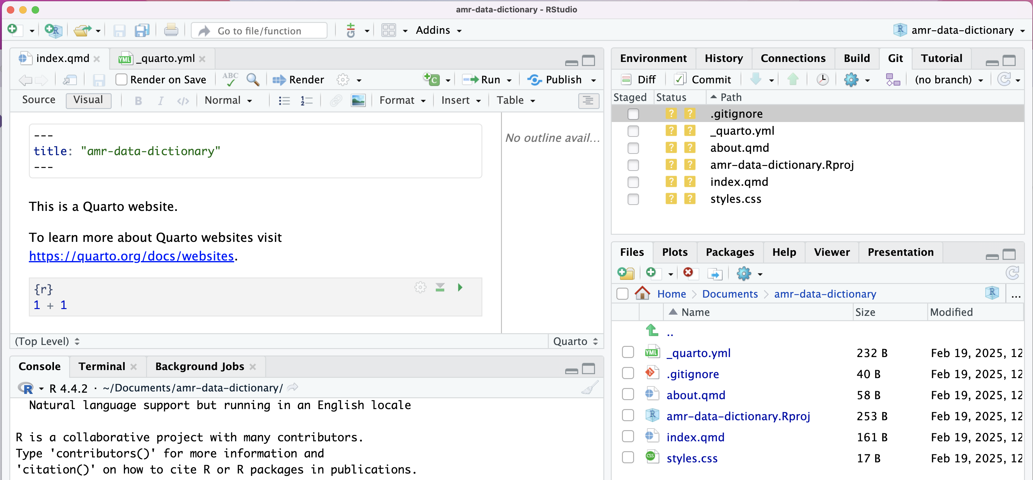
Image 1 of 1: ‘RStudio Git Diff icon, Git tab’
RStudio Git Diff icon, Git tab
Figure 4
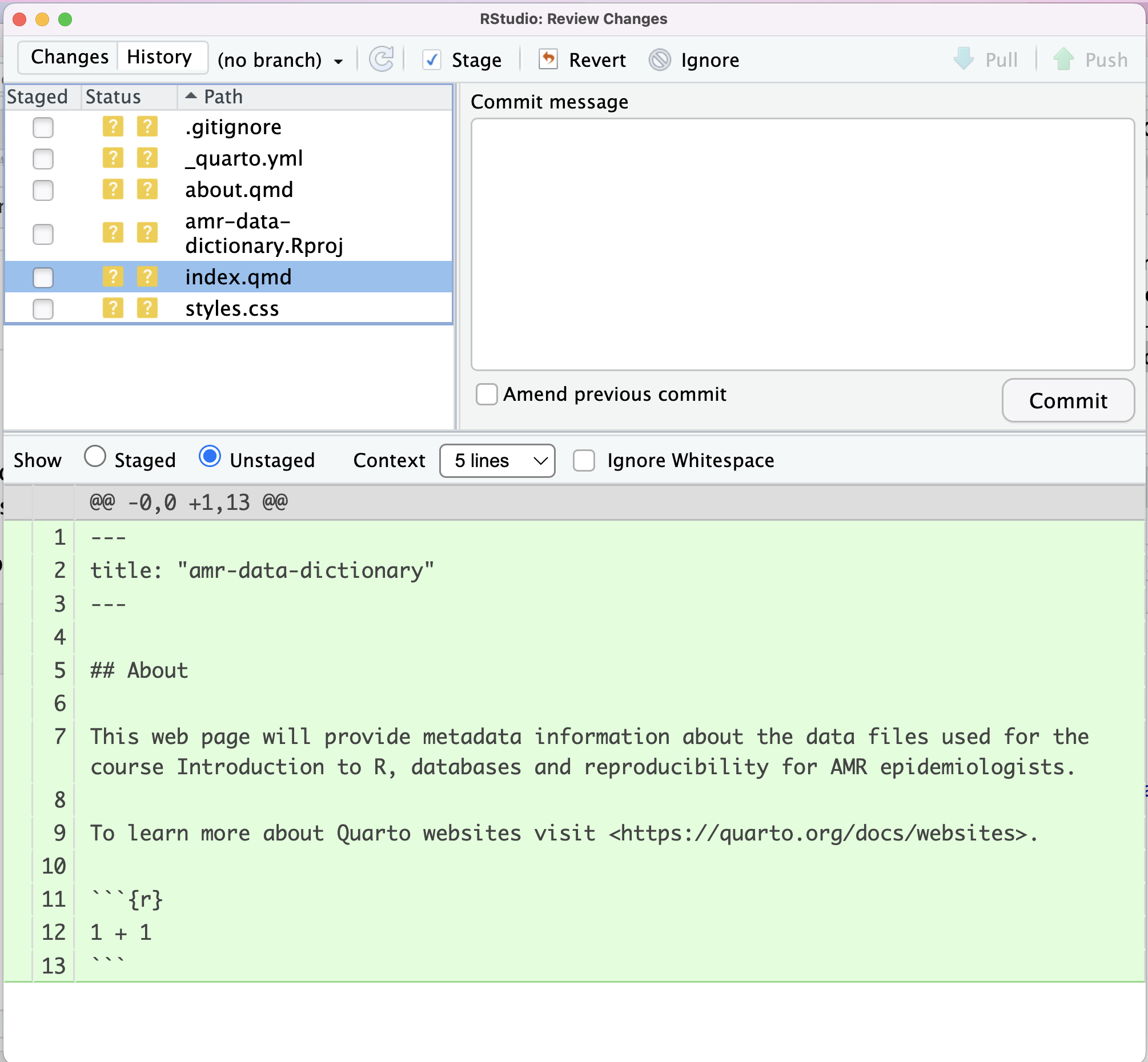
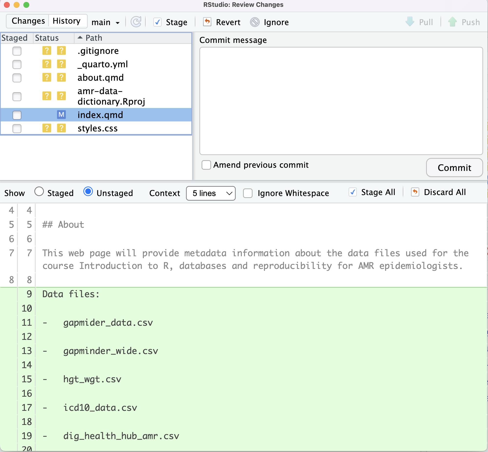
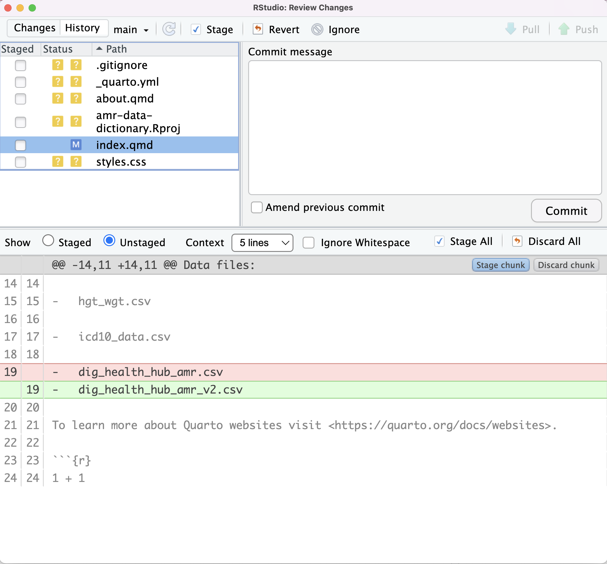
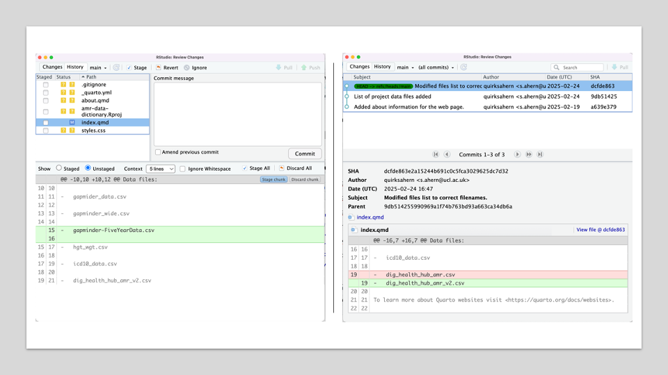
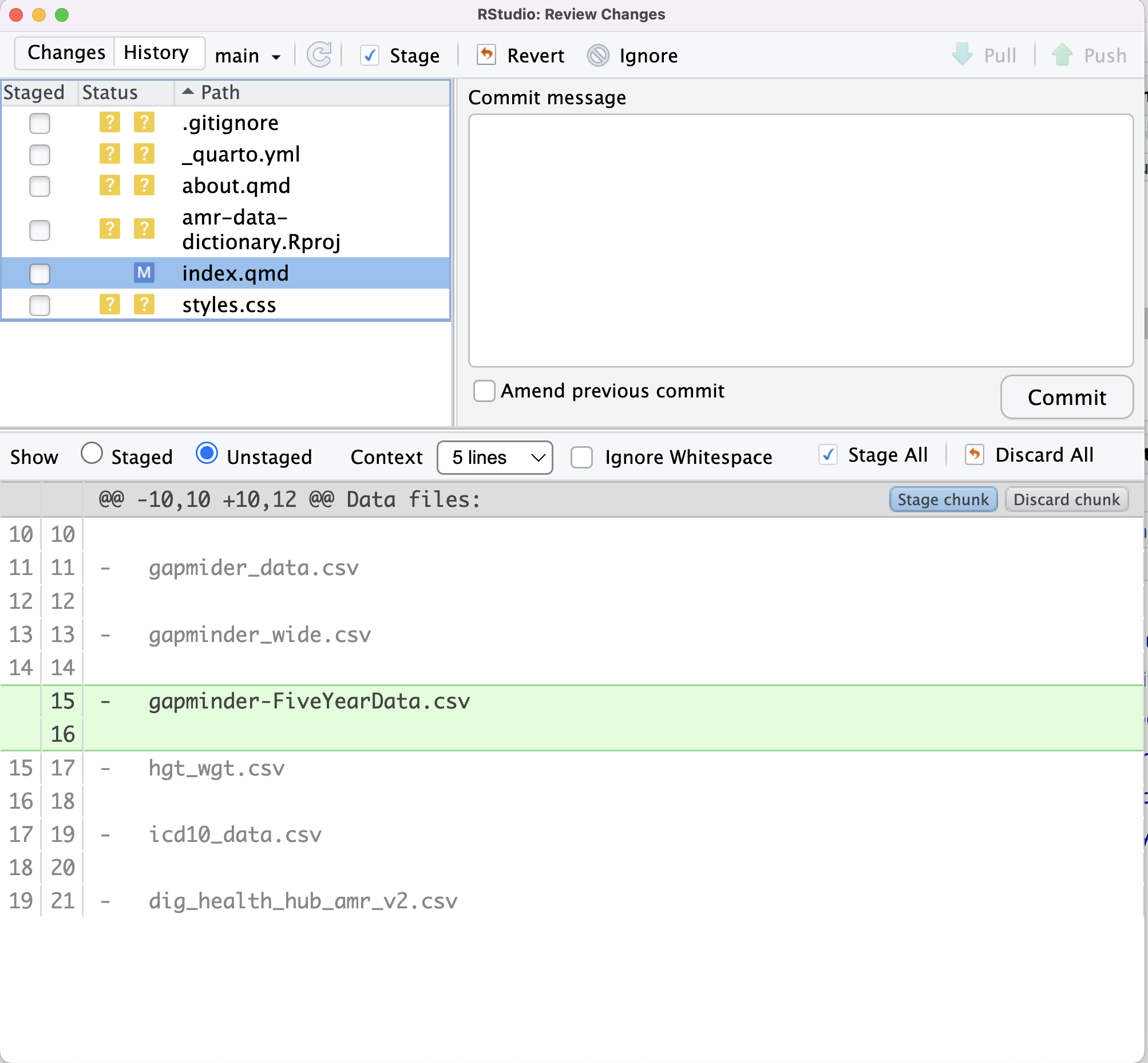
Image 1 of 1: ‘RStudio screenshot showing changes made to index.qmd and that these are unstaged.’
RStudio screenshot showing changes made to
index.qmd and that these are unstaged.
Figure 5
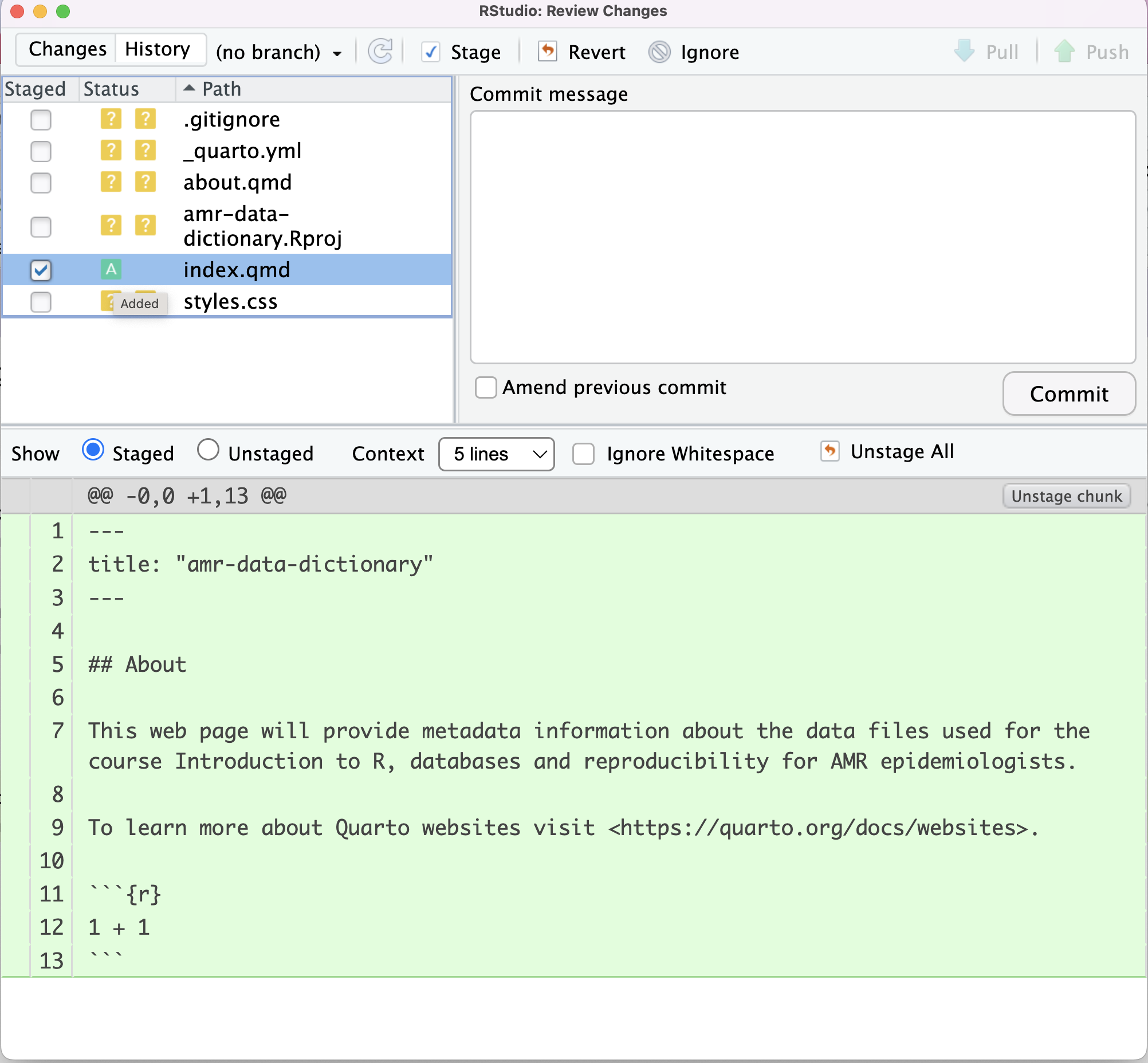
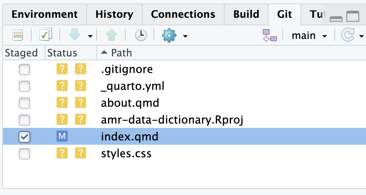
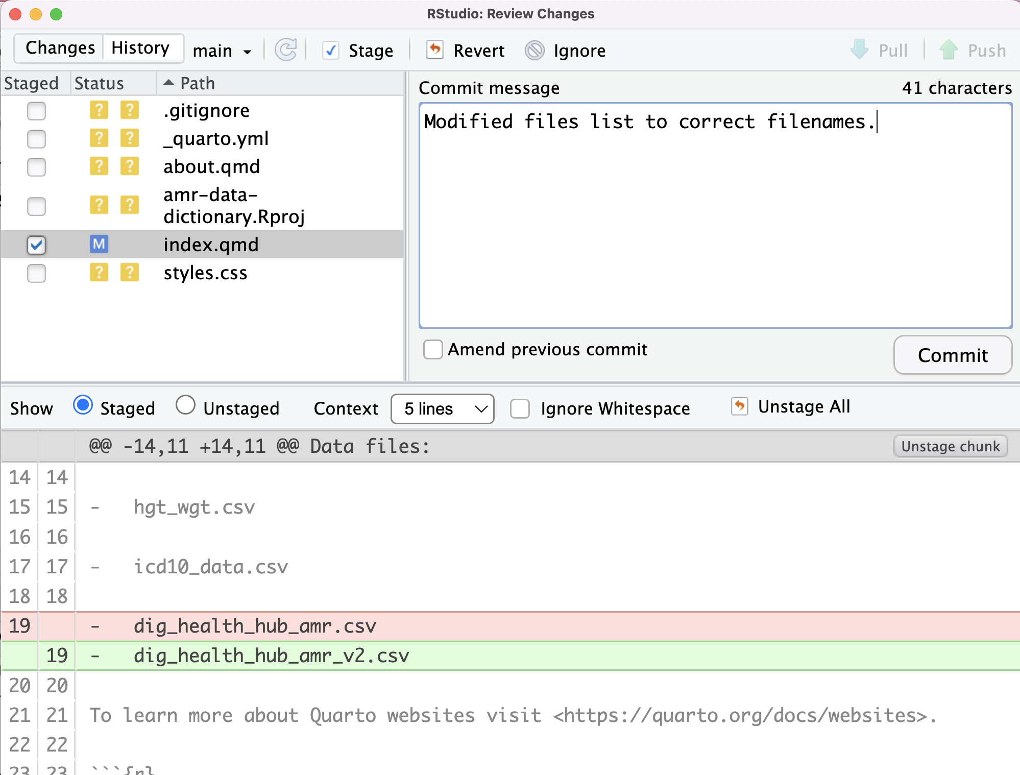
Image 1 of 1: ‘RStudio screenshot showing staging of index.qmd and change of ? to A under status column.’
RStudio screenshot showing staging of index.qmd
and change of ? to A under status column.
Figure 6
Image 1 of 1: ‘RStudio screenshot showing initial commit message for index.qmd.’
RStudio screenshot showing initial commit
message for index.qmd.
Figure 7
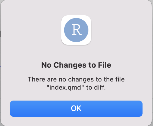
Image 1 of 1: ‘RStudio screenshot showing selection of Diff index.qmd on Git dropdown menu.’
RStudio screenshot showing selection of Diff
index.qmd on Git dropdown menu.
Figure 8
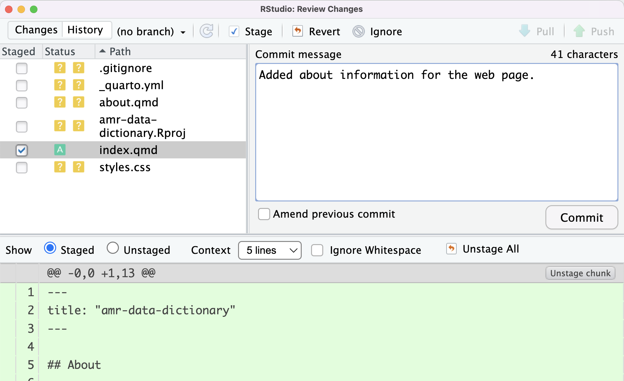
Image 1 of 1: ‘RStudio screenshot showing a dialogue box with the text “There are no changes to the file "index.qmd" to diff.”.’
RStudio screenshot showing a dialogue box with
the text “There are no changes to the file "index.qmd" to diff.”.
Figure 9
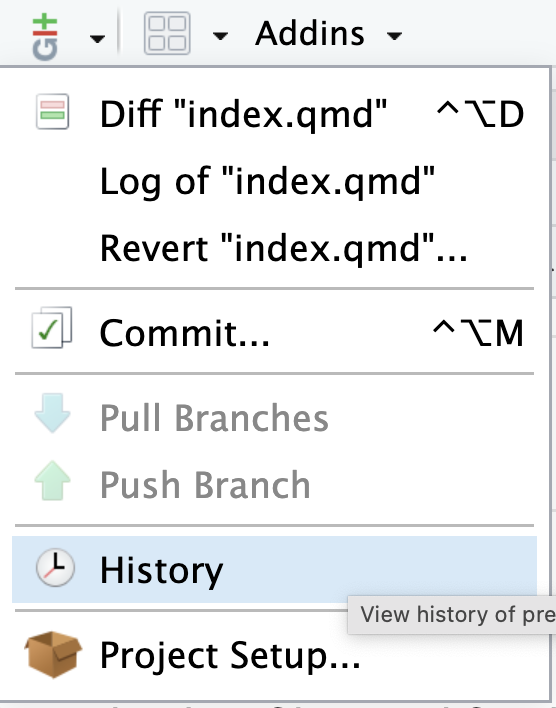
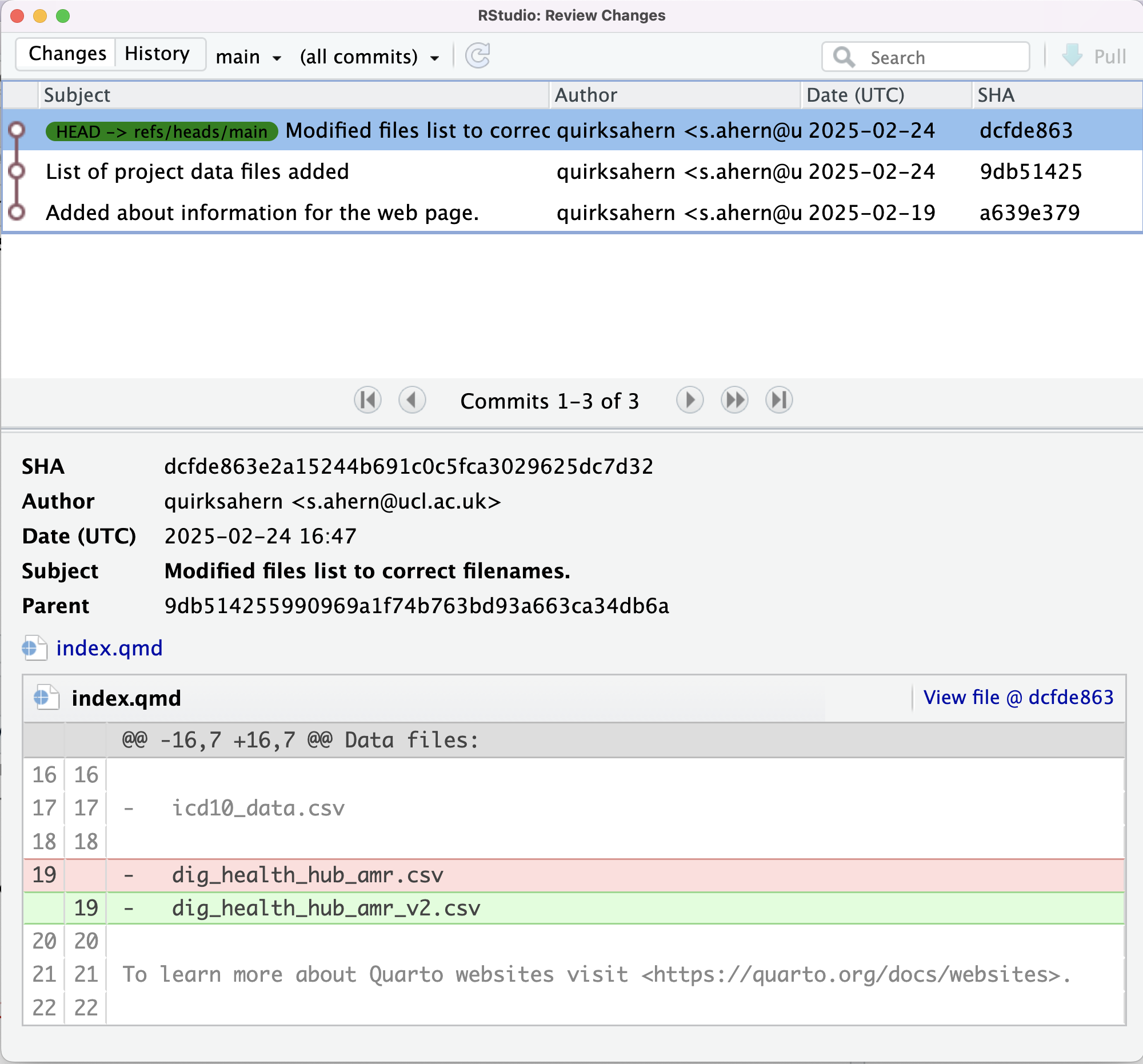
Image 1 of 1: ‘RStudio screenshot showing selection of History on Git dropdown menu.’
RStudio screenshot showing selection of History
on Git dropdown menu.
Figure 10
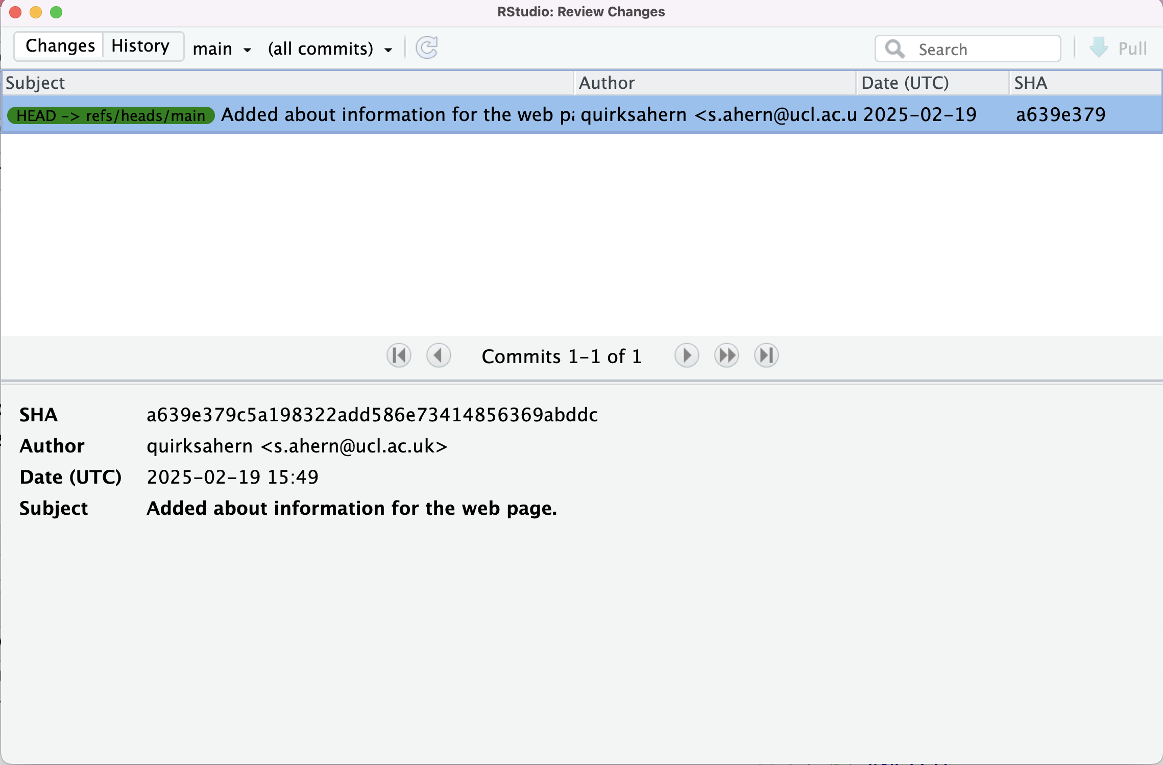
Image 1 of 1: ‘RStudio screenshot showing details of first commit in Git history.’
RStudio screenshot showing details of first
commit in Git history.
Figure 11
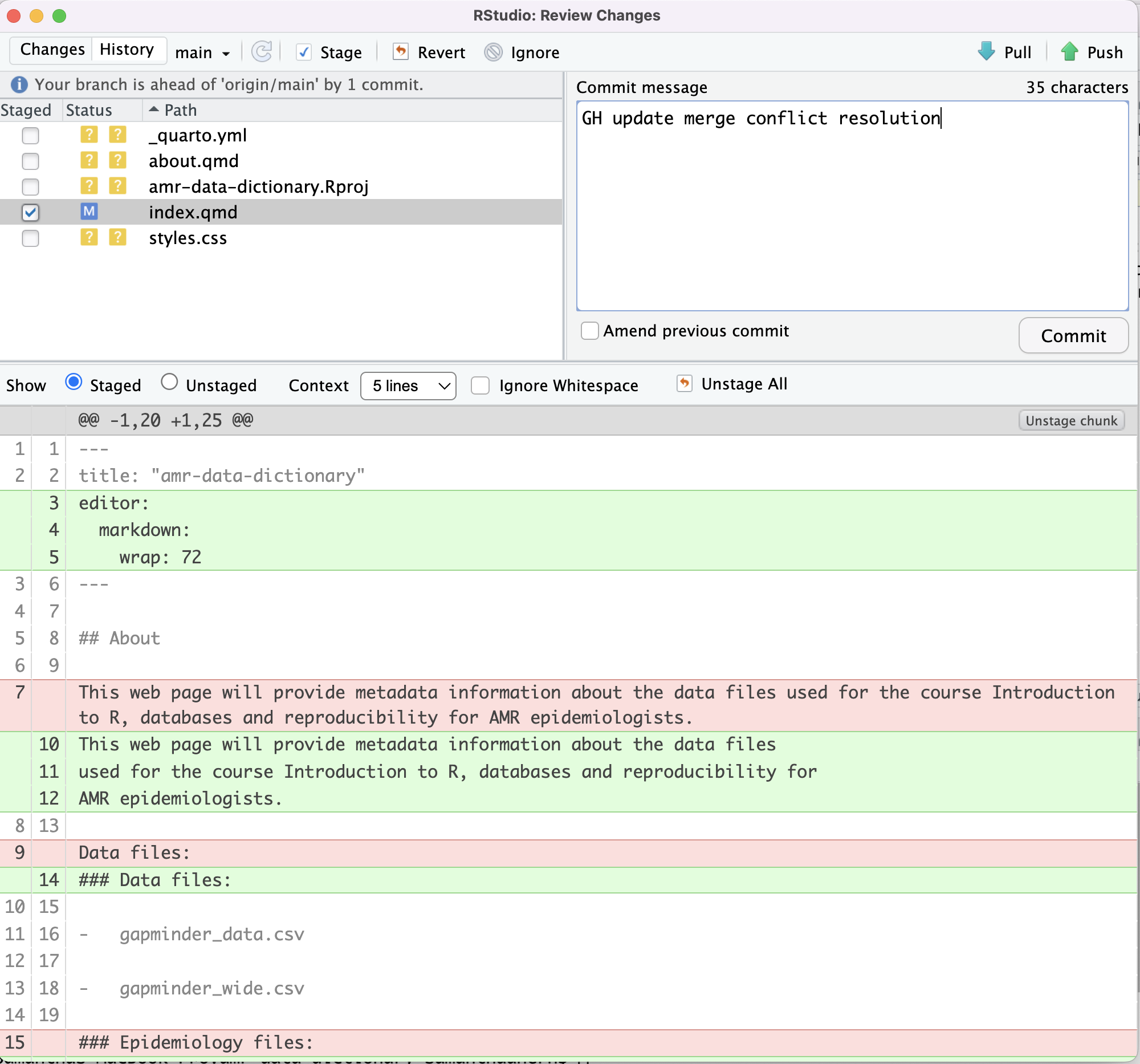
Image 1 of 1: ‘RStudio screenshot showing unstagged changes to index.qmd and the M flag to show that the file has been modified.’
RStudio screenshot showing unstagged changes to
index.qmd and the M flag to show that the file
has been modified.
Figure 12
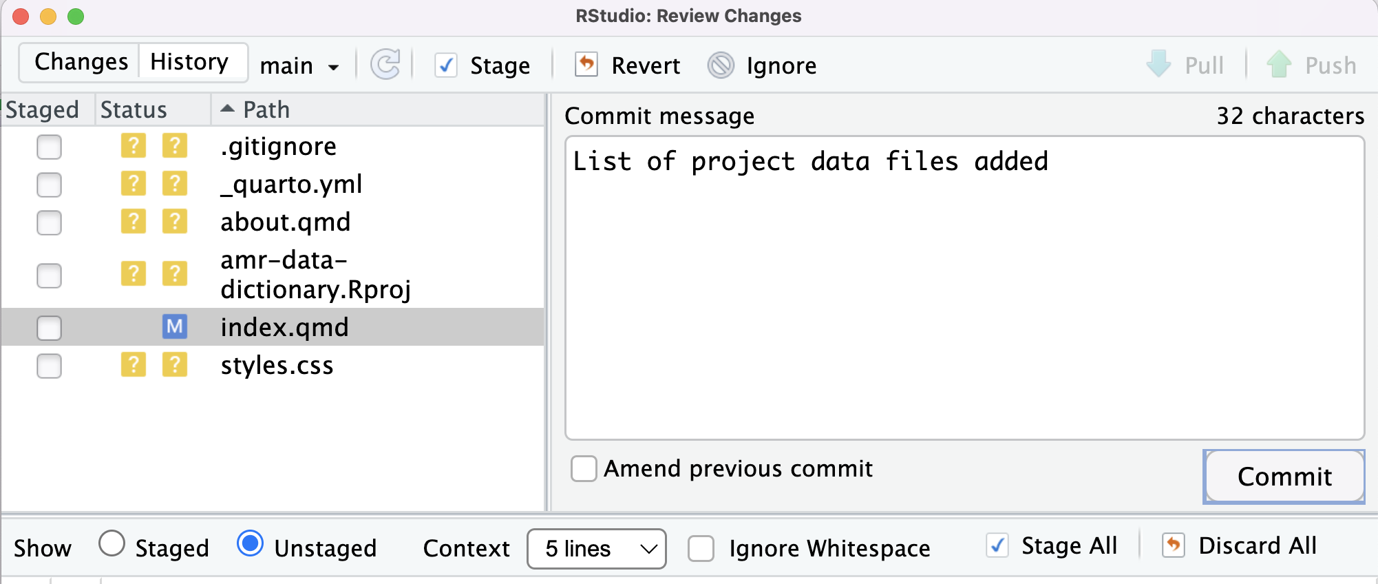
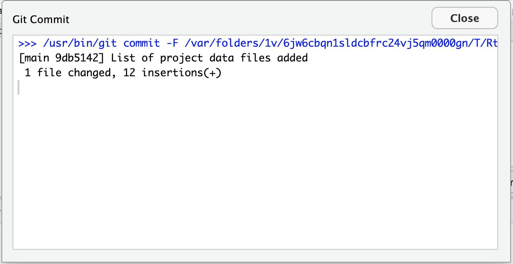
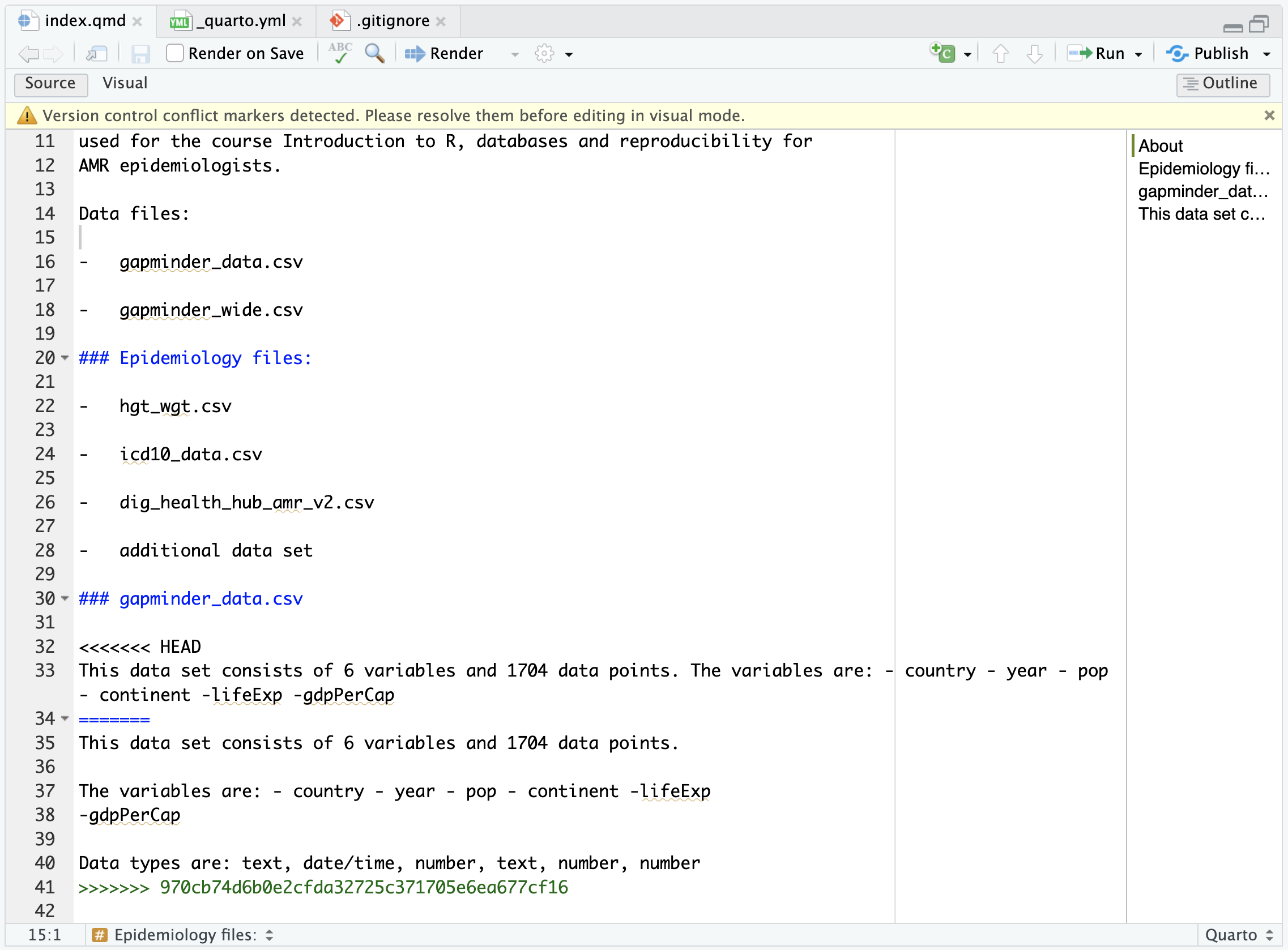
Image 1 of 1: ‘RStudio screenshot showing dialogue box when attempting to commit an unstaged commit.’
RStudio screenshot showing dialogue box when
attempting to commit an unstaged commit.
Figure 13
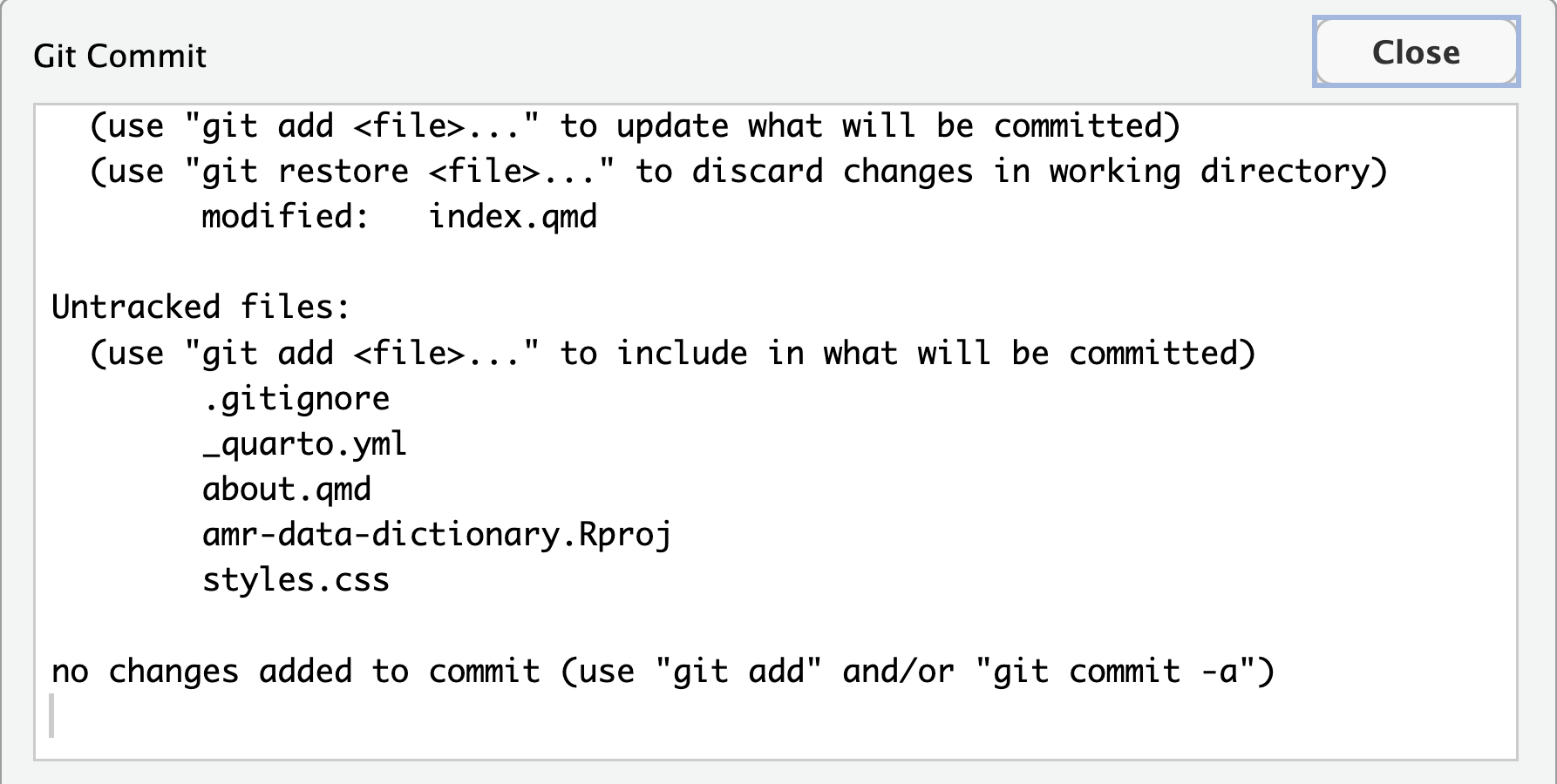
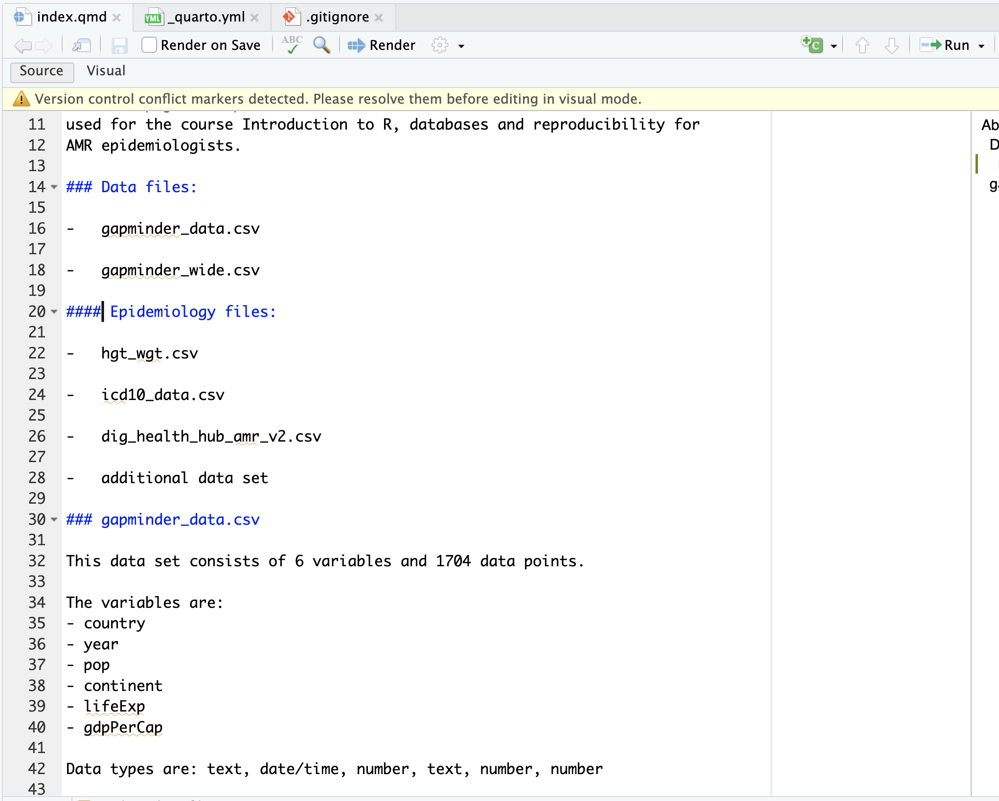
Image 1 of 1: ‘RStudio screenshot showing dialogue box when attempting to commit an unstaged commit.’
RStudio screenshot showing dialogue box when
attempting to commit an unstaged commit.
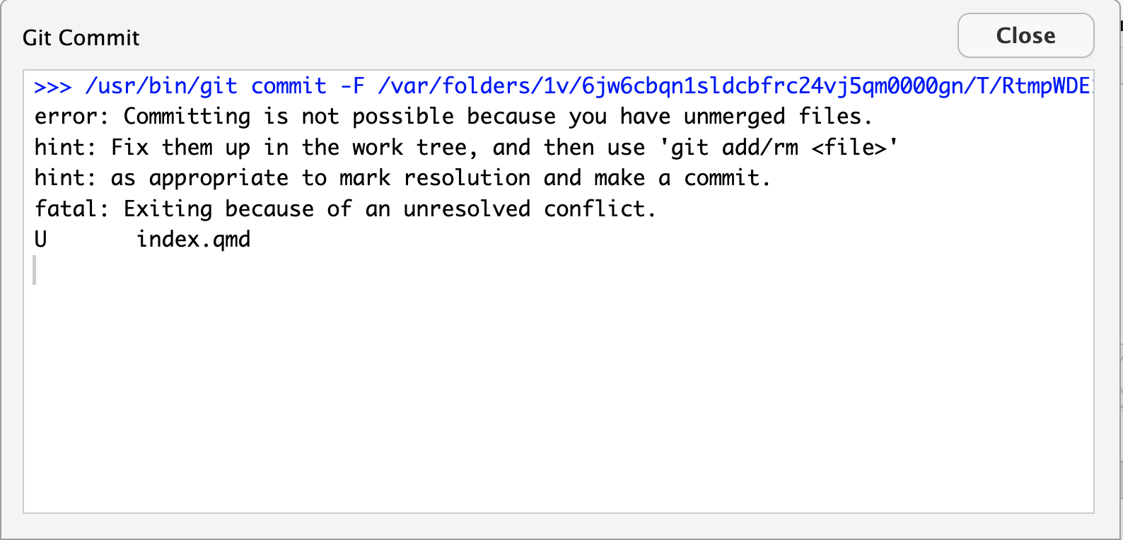
Figure 14
Image 1 of 1: ‘RStudio screenshot showing dialogue box when attempting to commit an unstaged commit.’
RStudio screenshot showing dialogue box when
attempting to commit an unstaged commit.
Figure 15
Image 1 of 1: ‘RStudio screenshot showing dialogue box confirming commit was successful.’
RStudio screenshot showing dialogue box
confirming commit was successful.
Figure 16
Image 1 of 1: ‘A diagram showing how git add registers changes in the staging area, while git commit moves changes from the staging area to the repository’
A diagram showing how git add
registers changes in the staging area, while git commit
moves changes from the staging area to the repository
Figure 17
Image 1 of 1: ‘A screenshot of RStudio highlighting changes to index.qmd’
A screenshot of RStudio highlighting changes to
index.qmd
Figure 18
Image 1 of 1: ‘A screenshot of RStudio showing commit message for change’
A screenshot of RStudio showing commit message
for change
Figure 19
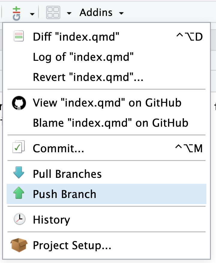
Image 1 of 1: ‘git History icon’
and look at the history of what we’ve done so far:
Figure 20
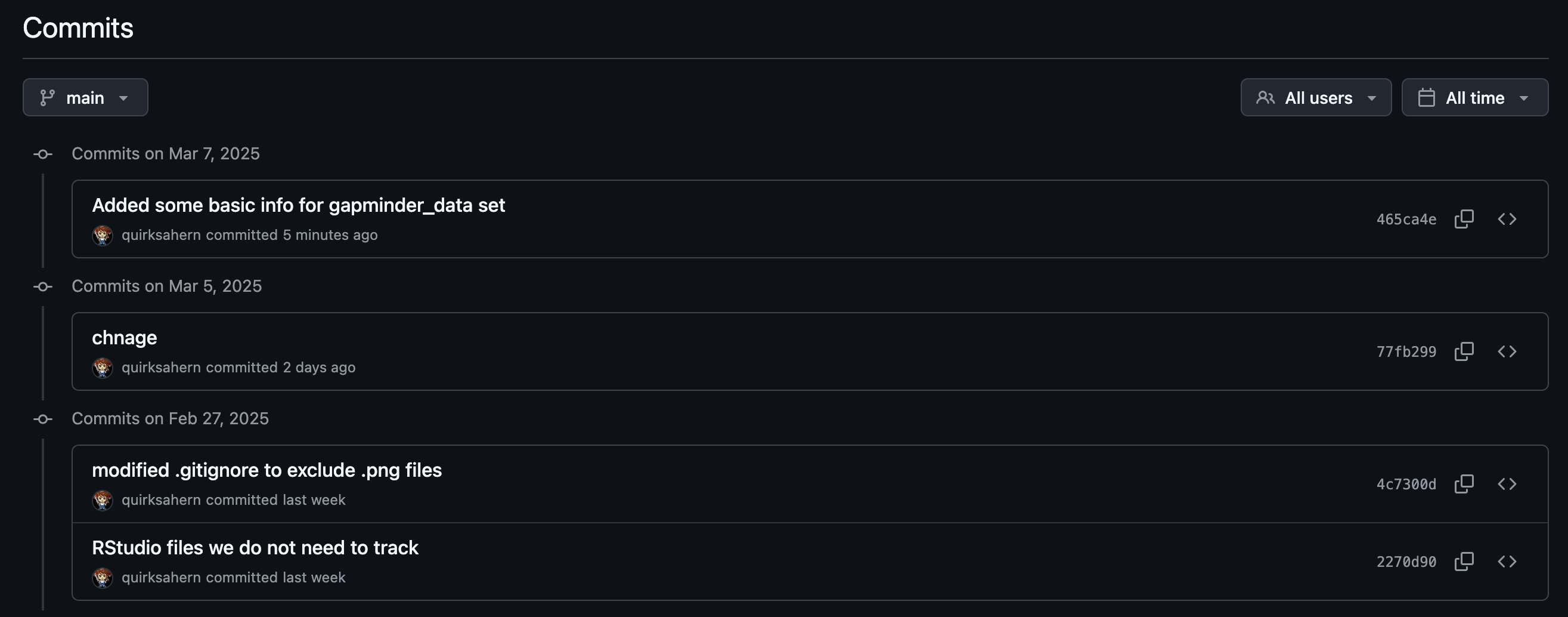
Image 1 of 1: ‘A screenshot of RStudio history of the 3 commits’
A screenshot of RStudio history of the 3
commits
Figure 21
Image 1 of 1: ‘A diagram showing two documents being separately staged using git add, before being combined into one commit using git commit’
A diagram showing two documents being separately
staged using git add, before being combined into one commit using git
commit
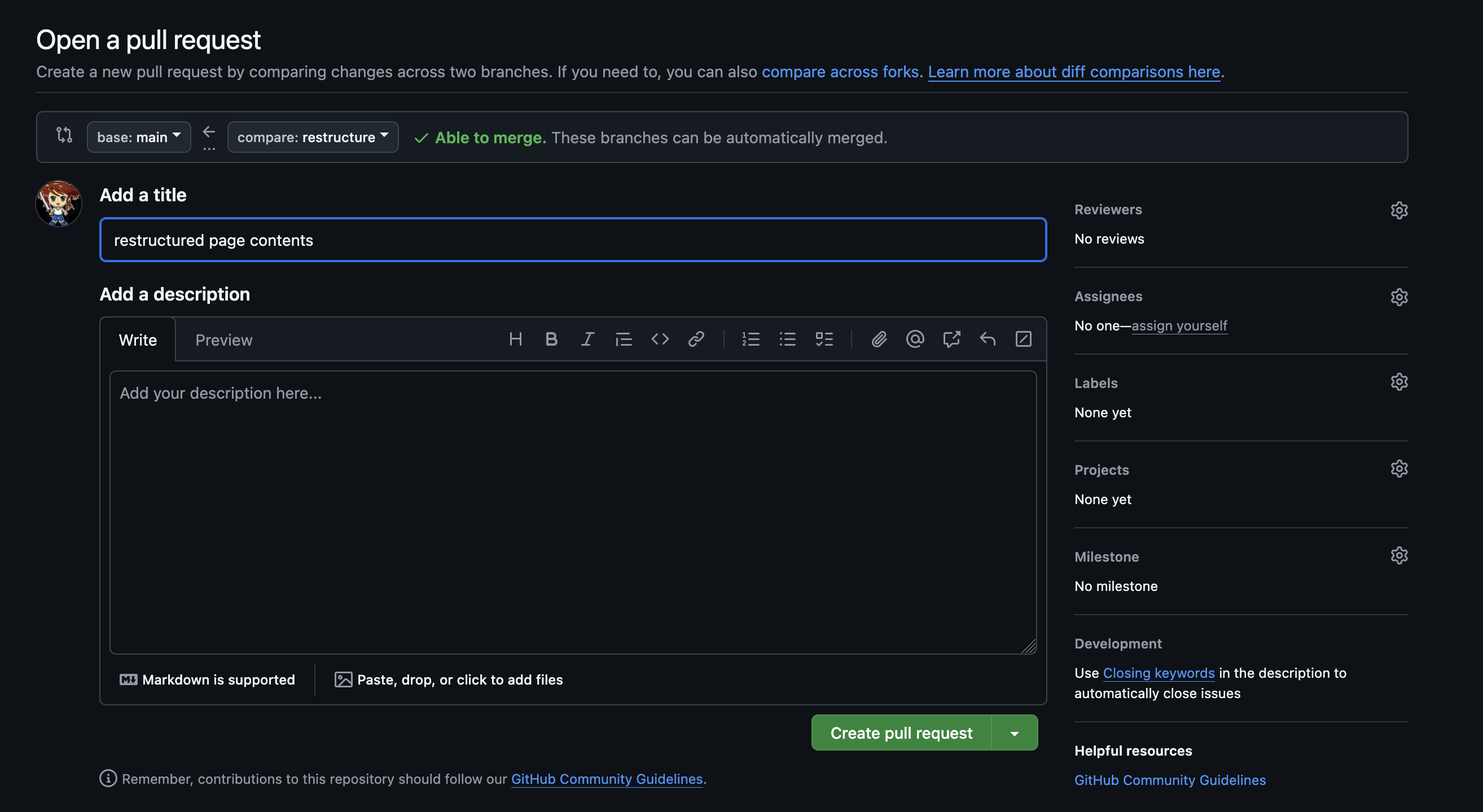
Image 1 of 1: ‘A screenshot showing the modified text of index.qmd’
Figure 2
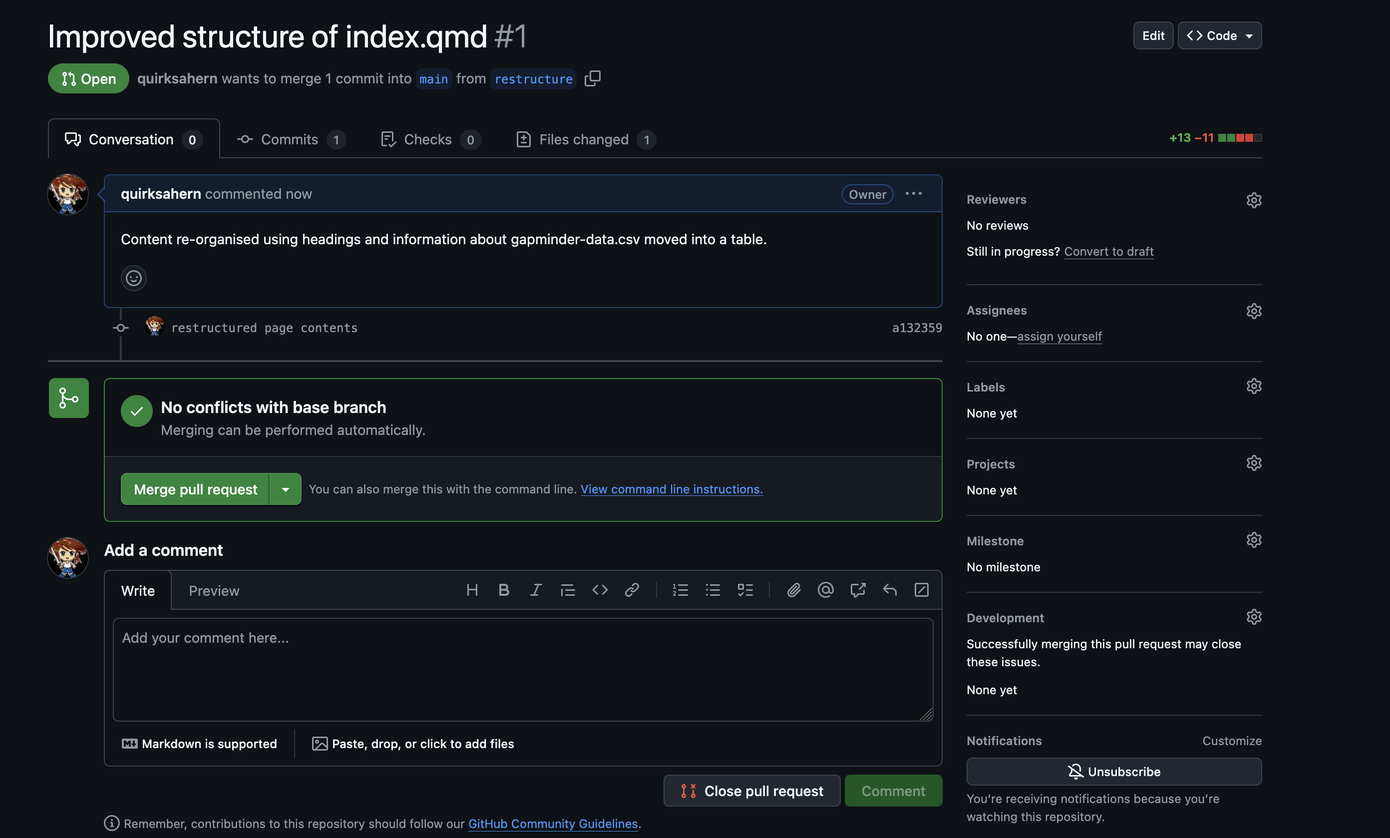
Image 1 of 1: ‘Combined screenshots showing chnages to index.qmd and that HEAD is referring to last commit’
Figure 3
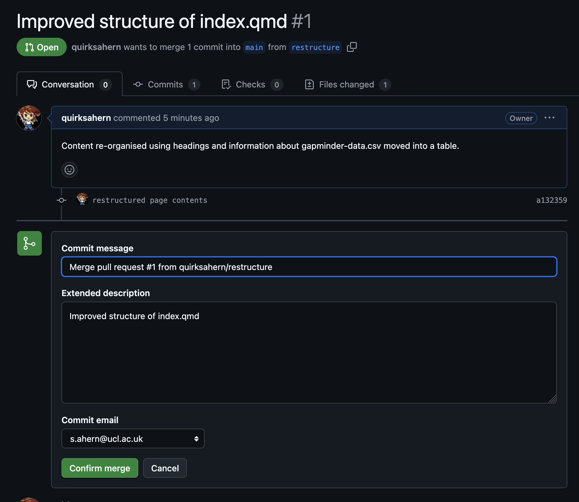
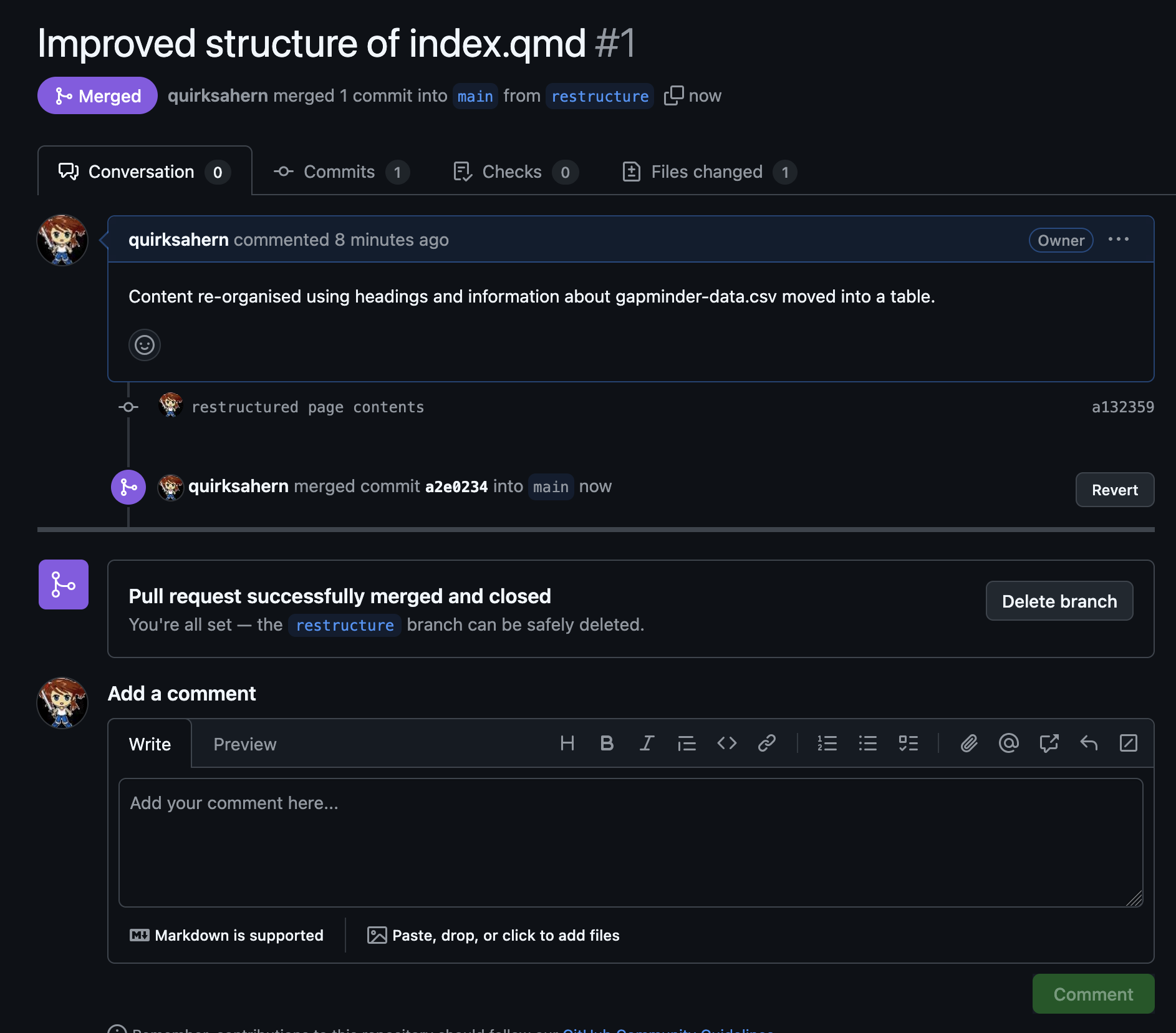
Image 1 of 1: ‘Combined screenshots showing changes to index.qmd and that HEAD is referring to last commit’
Figure 4
Image 1 of 1: ‘RStuio screenshot of the Revert icon’
Figure 5
Image 1 of 1: ‘A diagram showing how git restore can be used to restore the previous version of two files’
Figure 6
Image 1 of 1: ‘A diagram showing the entire git workflow: local changes are staged using git add, applied to the local repository using git commit, and can be restored from the repository using git checkout’
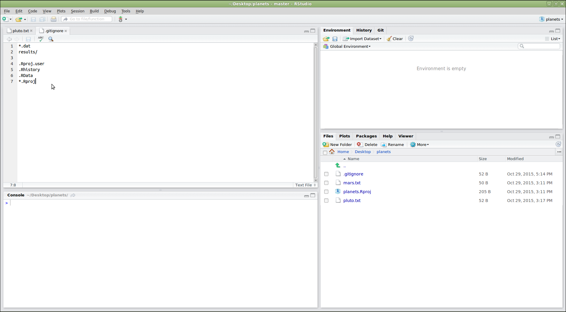
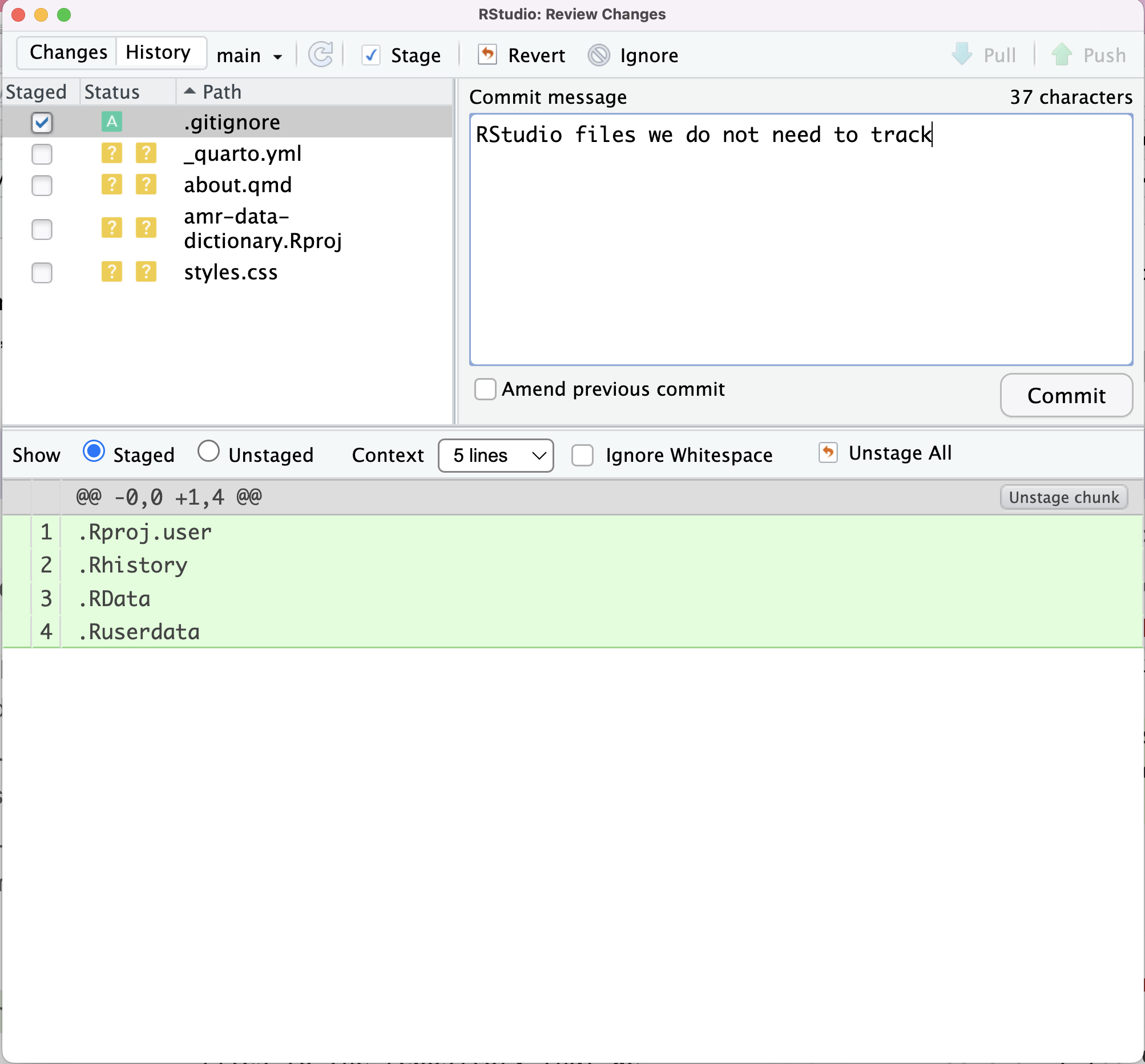
Image 1 of 1: ‘RStudio screenshot showing .gitignore open in the editor pane with the files .Rproj.user, .Rhistory, .RData, and *.Rproj added to the end’
Figure 2
Image 1 of 1: ‘RStudio screenshot showing .gitignore commit text’
Figure 3
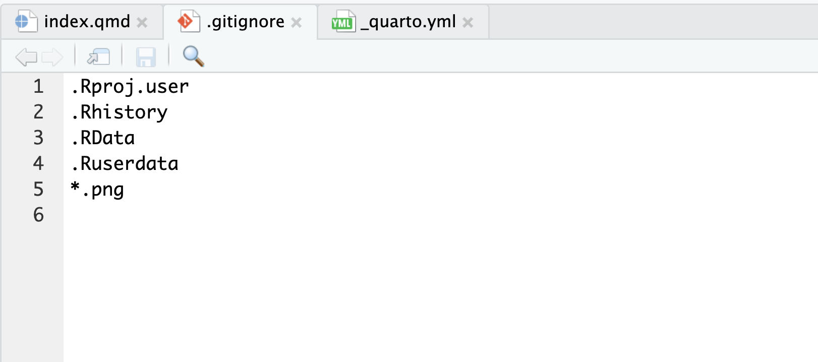
Image 1 of 1: ‘RStudio screenshot showing that the expansion of .gitignore to ignore .png files.’
Figure 4
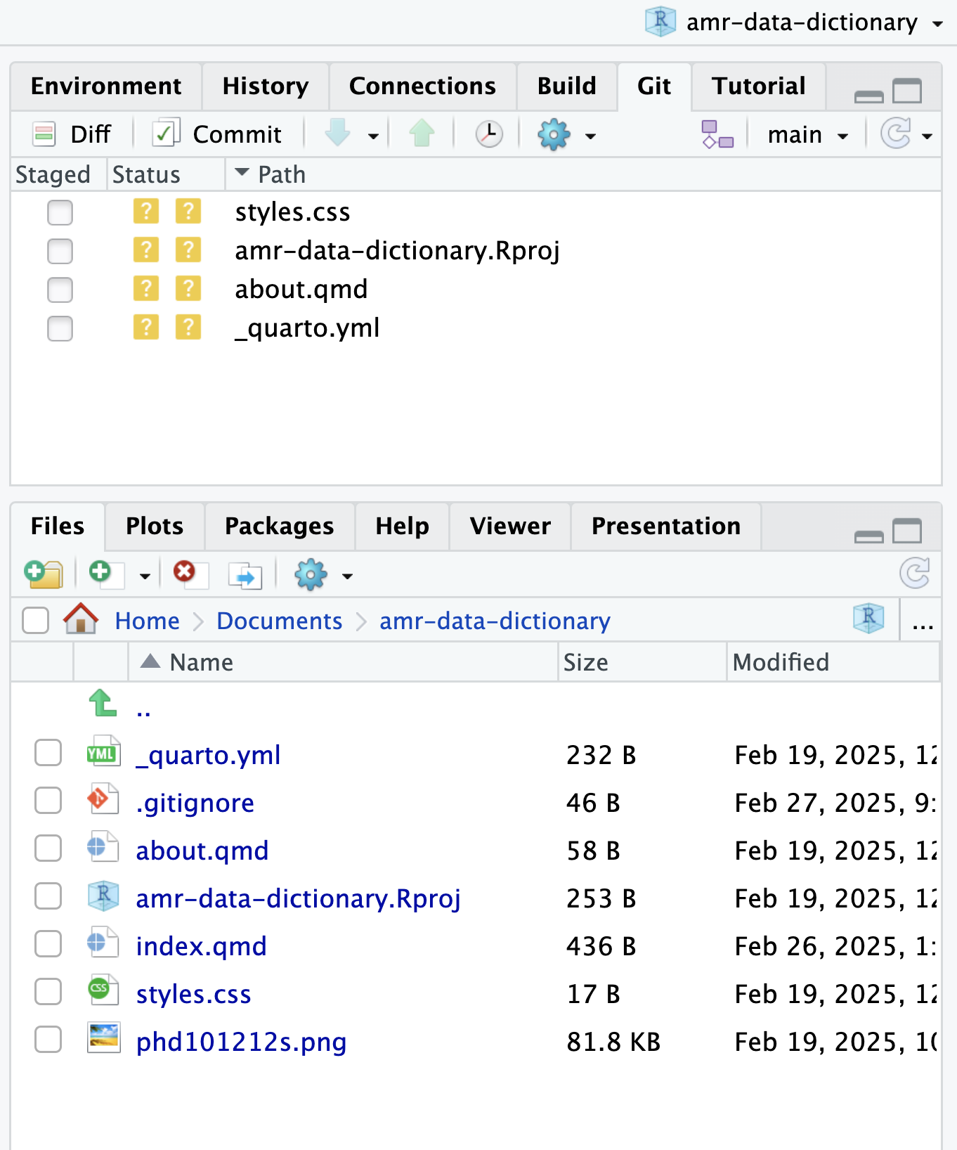
Image 1 of 1: ‘RStudio screenshot showing that the .png file has been ignored.’
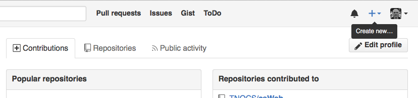
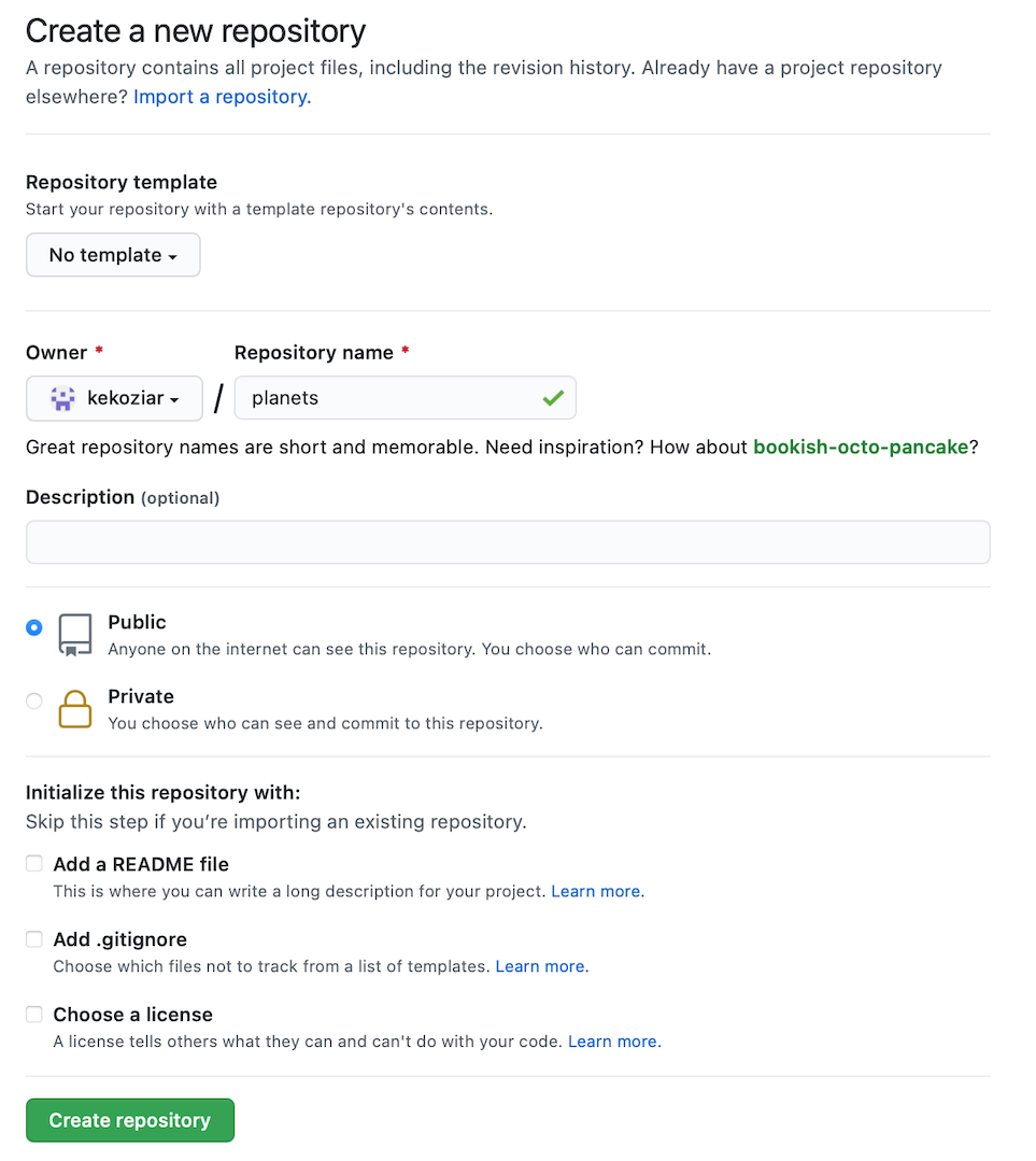
Image 1 of 1: ‘The first step in creating a repository on GitHub: clicking the "create new" button’
Figure 2
Image 1 of 1: ‘The second step in creating a repository on GitHub: filling out the new repository form to provide the repository name, and specify that neither a readme nor a license should be created’
Figure 3
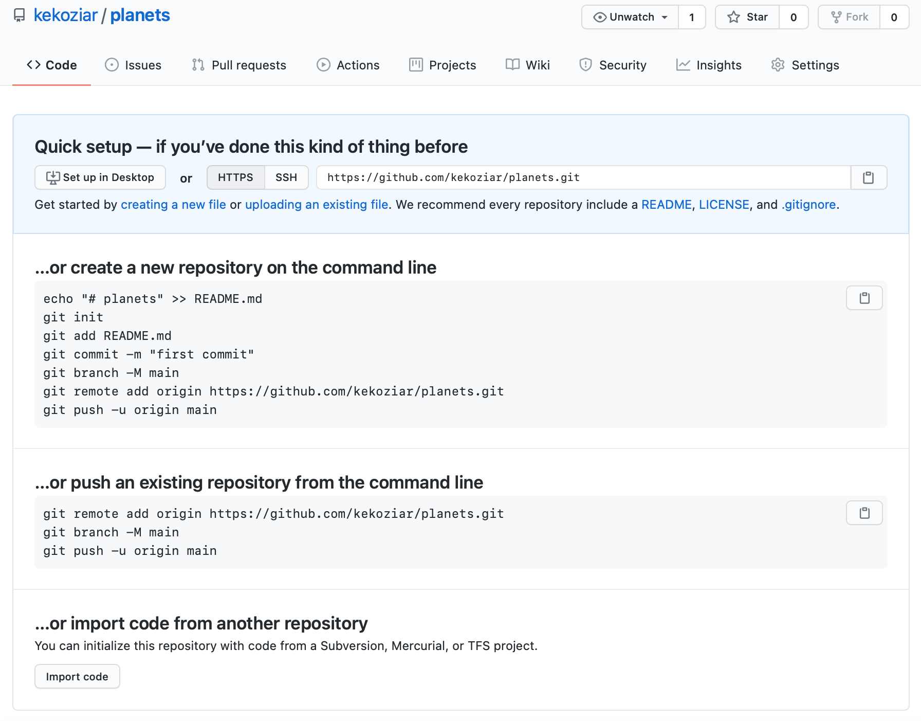
Image 1 of 1: ‘The summary page displayed by GitHub after a new repository has been created. It contains instructions for configuring the new GitHub repository as a git remote’
Figure 4
Image 1 of 1: ‘A diagram showing how "git add" registers changes in the staging area, while "git commit" moves changes from the staging area to the repository’
Figure 5
Image 1 of 1: ‘A diagram illustrating how the GitHub "recipes" repository is also a git repository like our local repository, but that it is currently empty’
Figure 6
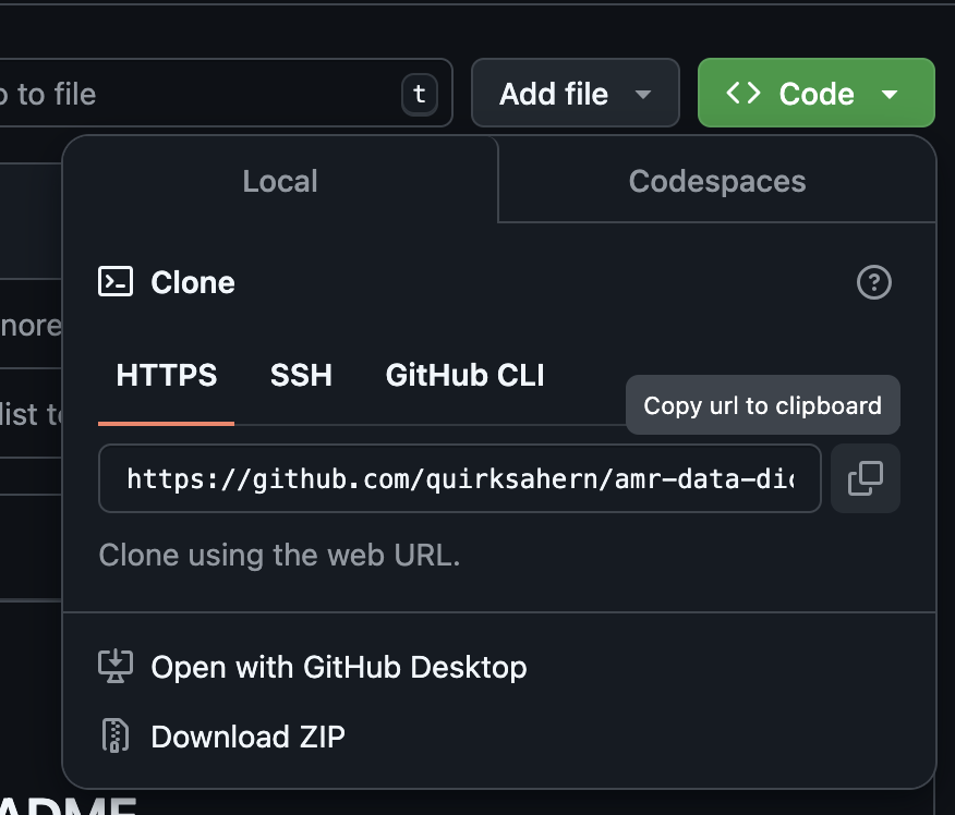
Image 1 of 1: ‘HTTPS URL for repository’
Figure 7
Image 1 of 1: ‘A screenshot of GitHub showing the local files mirrored in the remote repository’
Figure 8
Image 1 of 1: ‘A diagram showing how "git push origin" will push changes from the local repository to the remote, making the remote repository an exact copy of the local repository.’
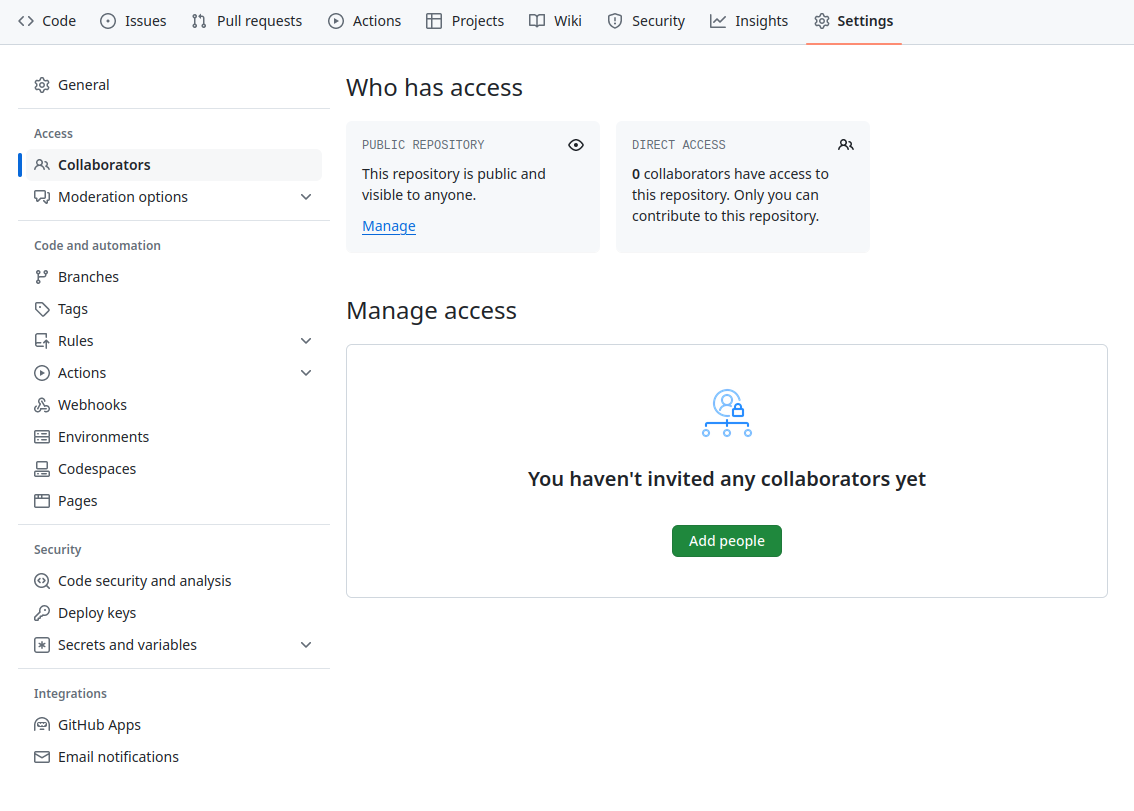
Image 1 of 1: ‘A screenshot of the GitHub Collaborators settings page, which is accessed by clicking "Settings" then "Collaborators"’
Figure 2
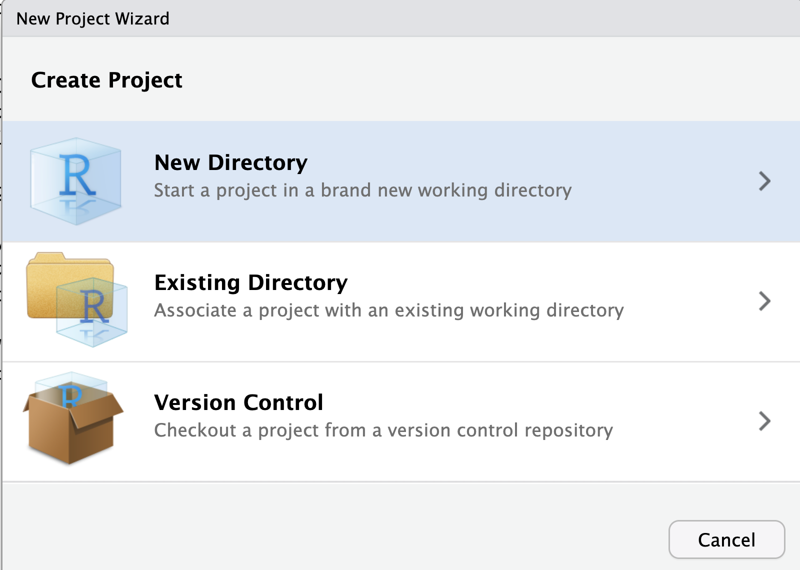
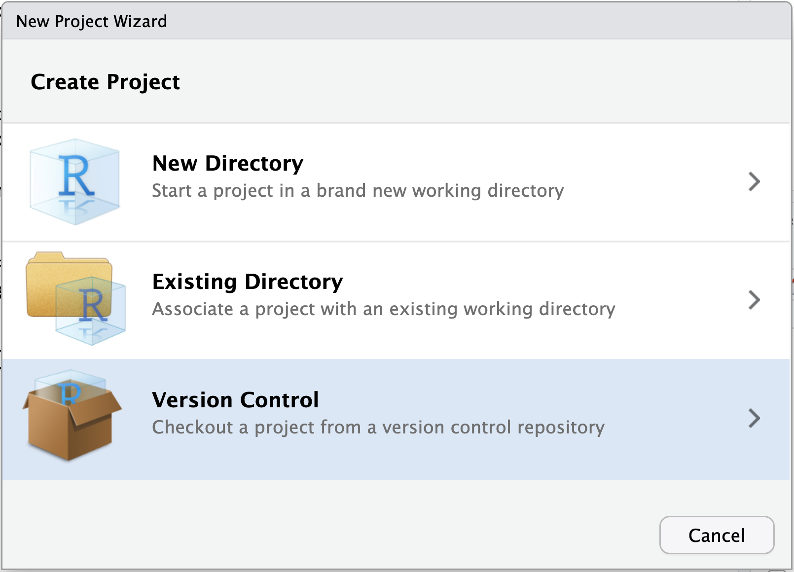
Image 1 of 1: ‘A screenshot of RStudio New Project wizard dialogue box showing the threee options available’
Figure 3
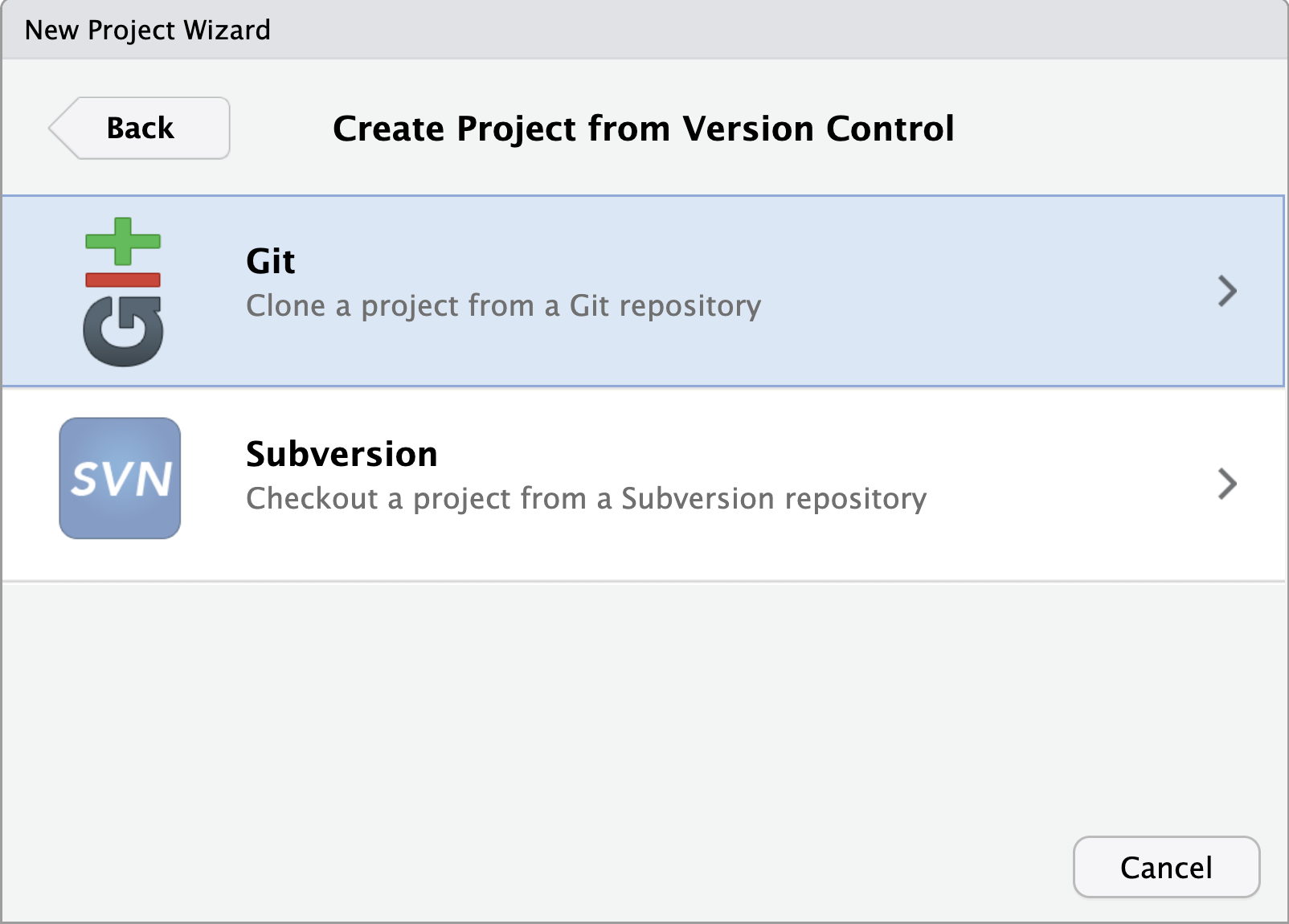
Image 1 of 1: ‘A screenshot of RStudio New Project wizard dialogue box showing Git and SVN as options’
Figure 4
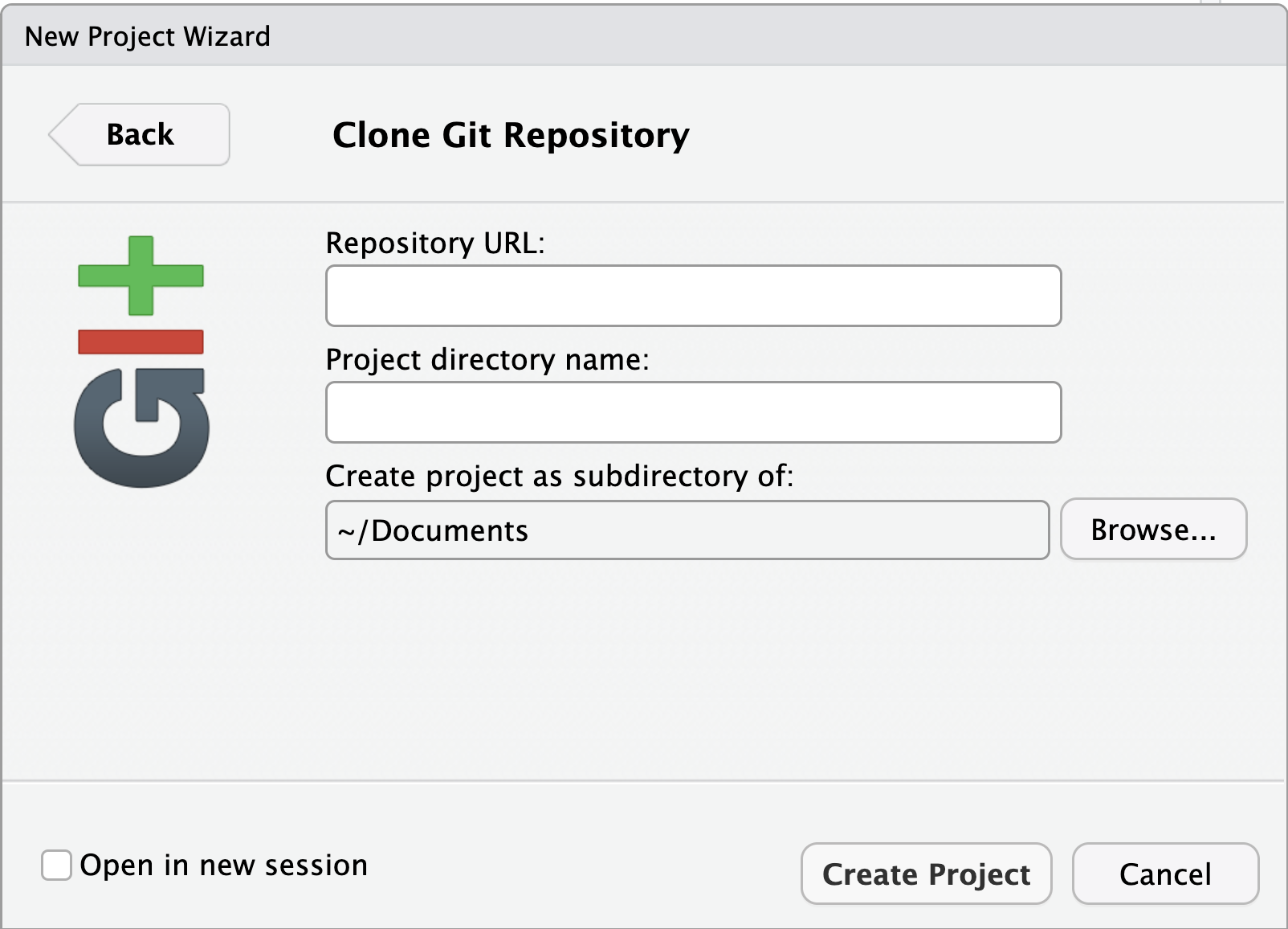
Image 1 of 1: ‘A screenshot of RStudio New Project wizard dialogue box showing Git repository information required’
Figure 5
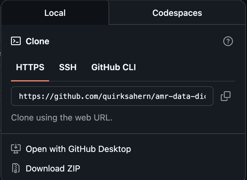
Image 1 of 1: ‘A screenshot of GitHub showing clone URL’
Figure 6
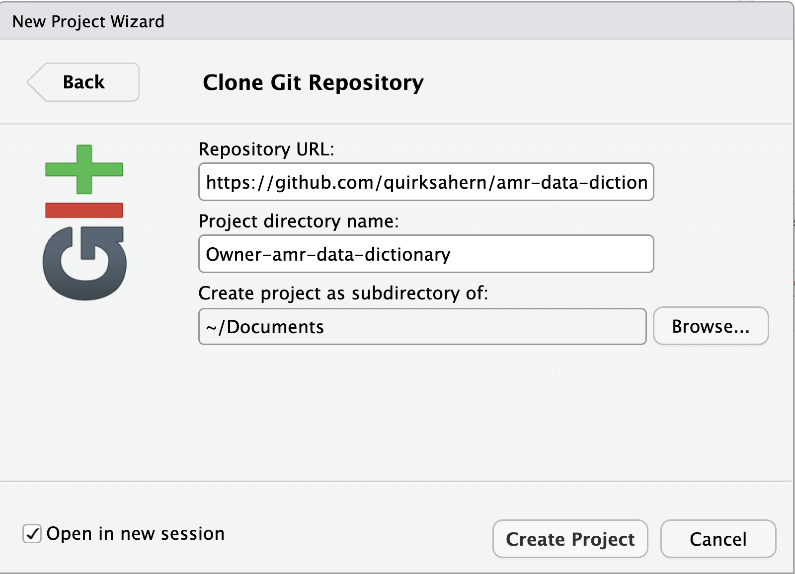
Image 1 of 1: ‘A screenshot of RStudio dialogue box showing completed details of repo to be cloned.’
Figure 7
Image 1 of 1: ‘A screenshot of RStudio dialogue box showing completed details of repo to be cloned.’
Figure 8
Image 1 of 1: ‘A diagram showing that "git clone" can create a copy of a remote GitHub repository, allowing a second person to create their own local repository that they can make changes to.’
Figure 9
Image 1 of 1: ‘A screenshot of RStudio showing amendments to index.qmd.’
Figure 10
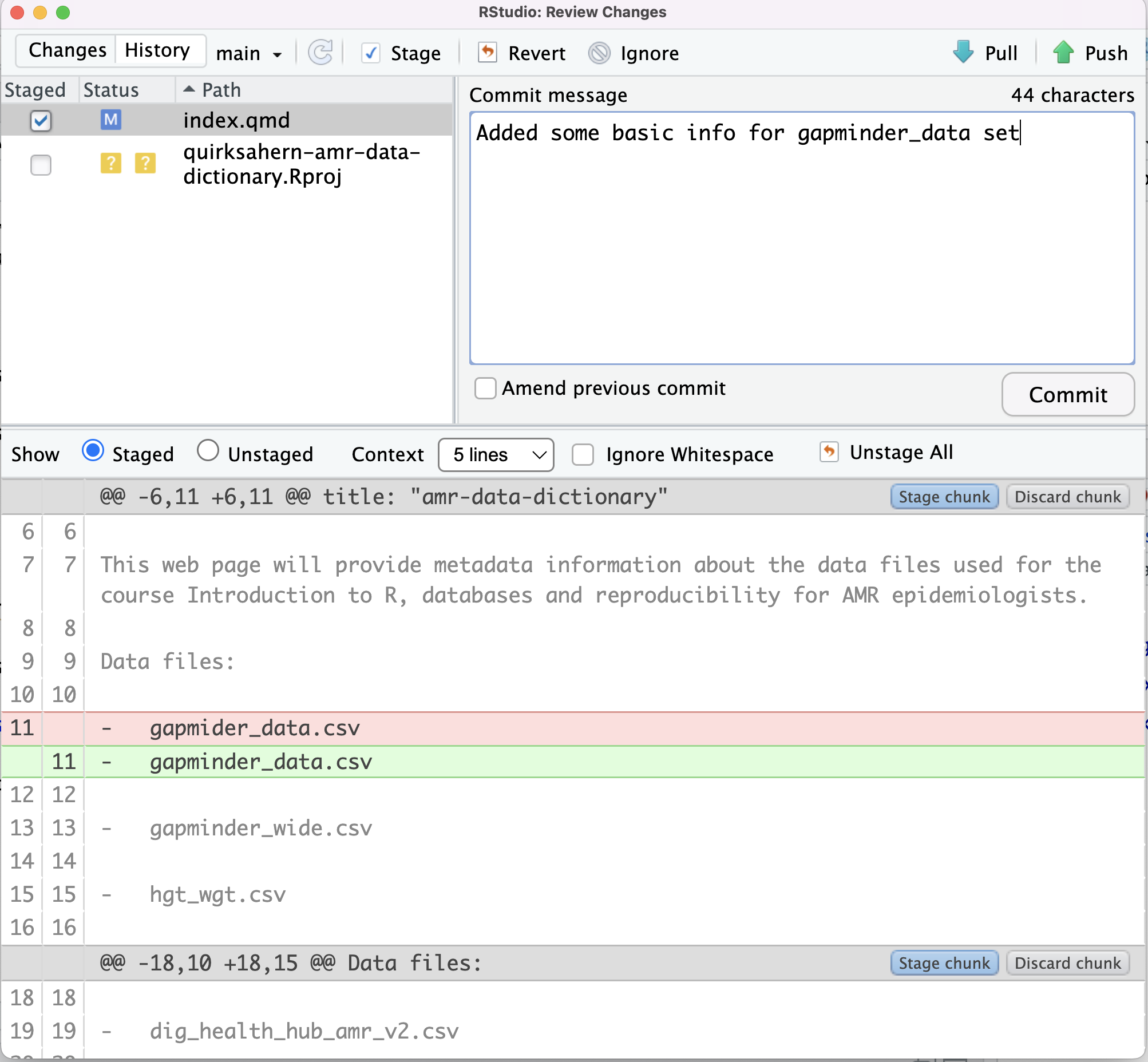
Image 1 of 1: ‘A screenshot of RStudio showing commit window and meesage for amended file.’
Figure 11
Image 1 of 1: ‘A screenshot of RStudio showing commit window and meesage for amended file.’
Figure 12
Image 1 of 1: ‘A screenshot of GitHub showing the commit history of the cloned repo, and showing latest `push`’
Figure 13
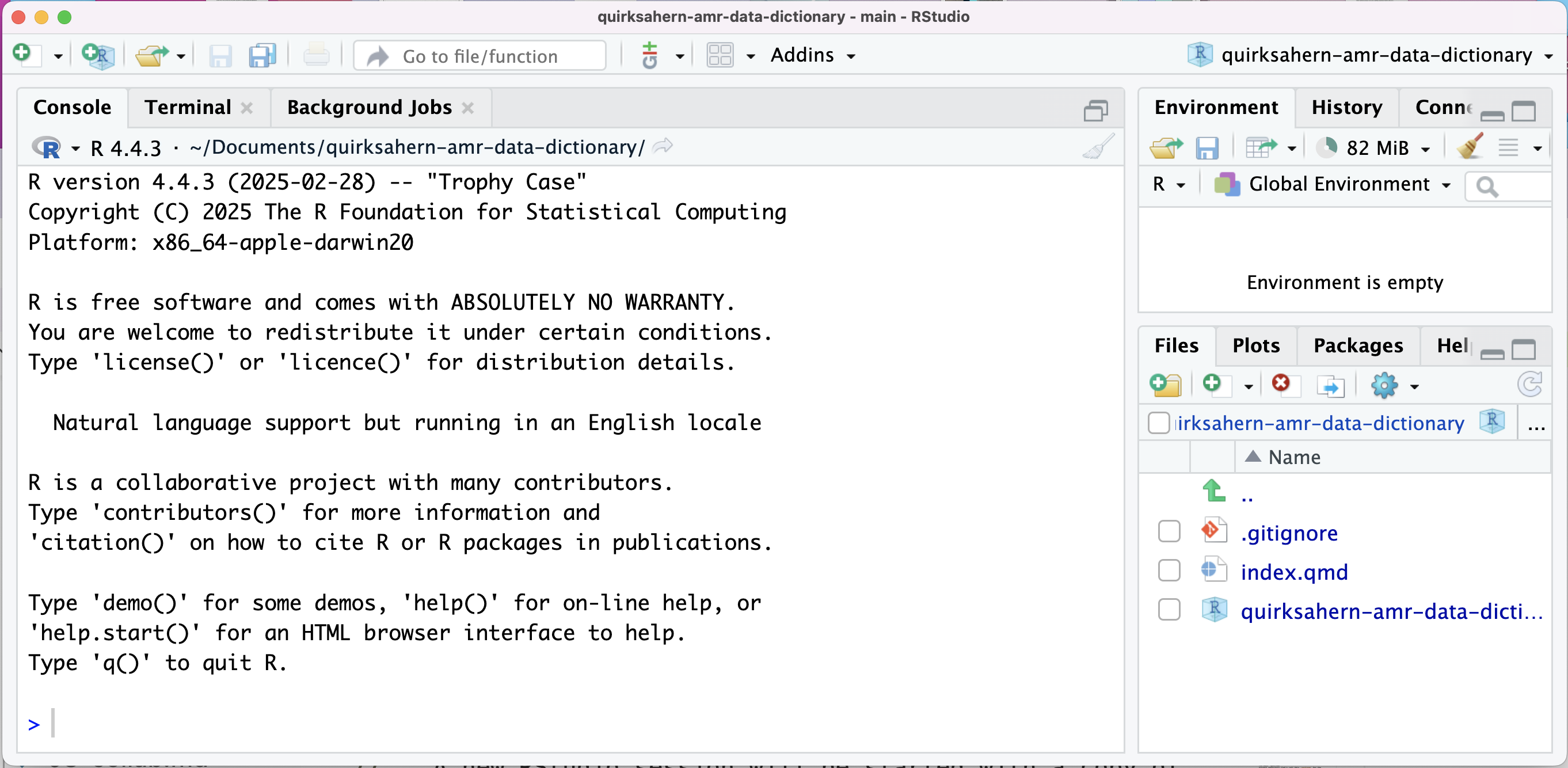
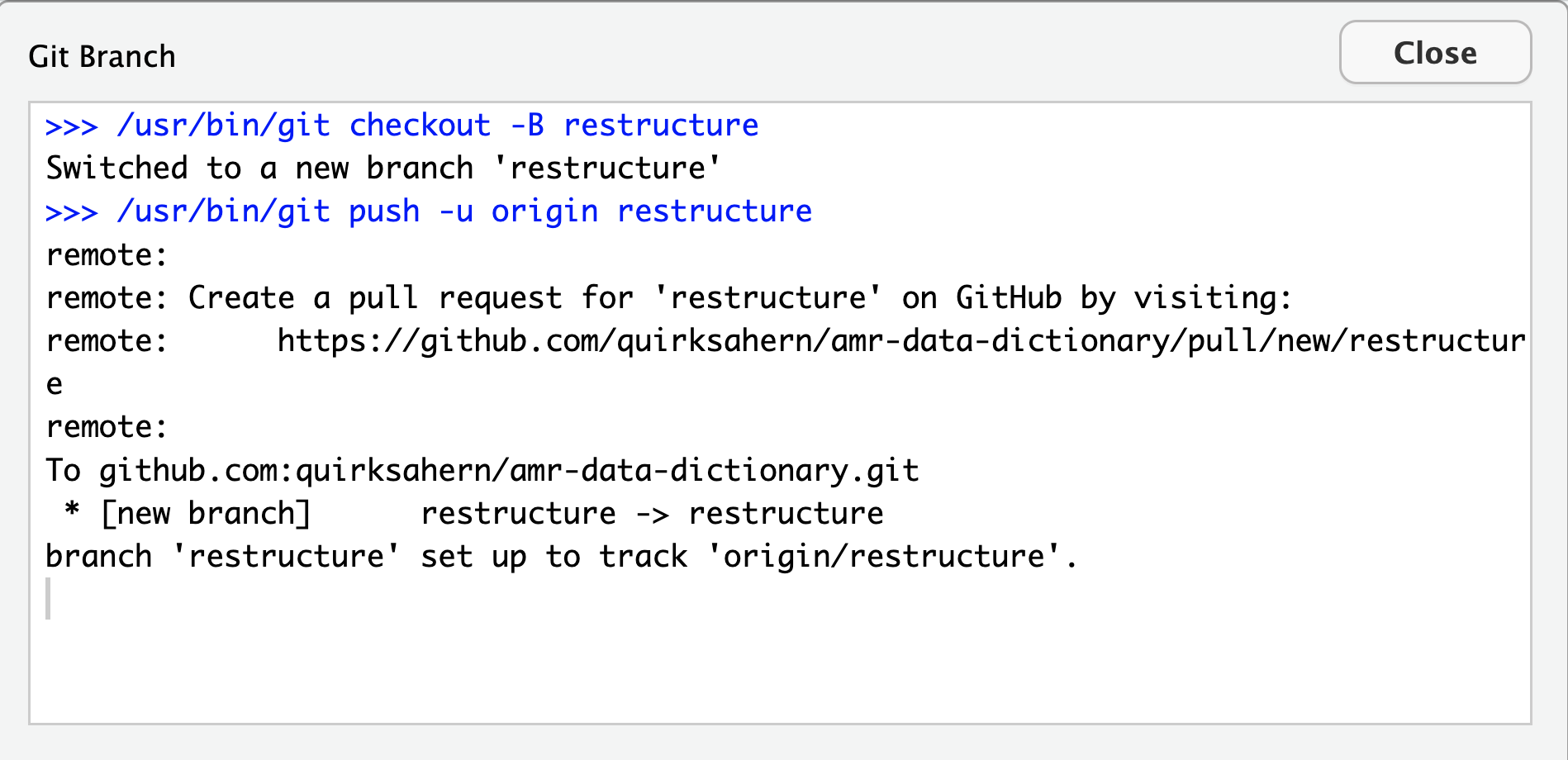
Image 1 of 1: ‘A screenshot of RStudio showing owner's file and Pull option’
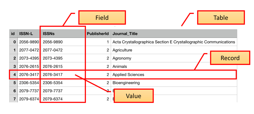
Image 1 of 1: ‘Labelled image of a database table identifying Table, Field, Record and Value’
These tables can be linked to each other when a field in one table can
be matched to a field in another table. To enable this one column in
each table is identified as a primary key. A primary key, often
designated as PK, is one attribute of an entity that distinguishes it
from the other entities (or records) in your table. The primary key must
be unique for each row for this to work. A common way to create a
primary key in a table is to make an ‘id’ field that contains an
auto-generated integer that increases by 1 for each new record. This
will ensure that your primary key is unique.
Figure 2
Image 1 of 1: ‘E-R diagram showing the three tables of the database and the relationship between them’
Relationships between entities and their attributes are represented by
lines linking them together. For example, the line linking amr and trust
is interpreted as follows: The ‘amr’ entity is related to the ‘trust’
entity through the attributes ‘trst_cd’ and ‘nhs_trust_code’
respectively.
Figure 3
Image 1 of 1: ‘Visualisation of different types of SQL join’
Figure 4
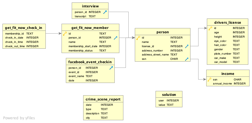
Image 1 of 1: ‘E-R diagram showing relationship between police files’


 If we want to remove one column only from the
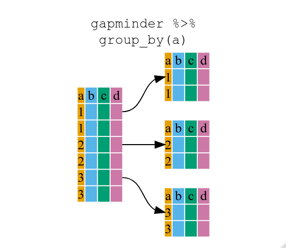

 We can also look at where the specimens were processed:
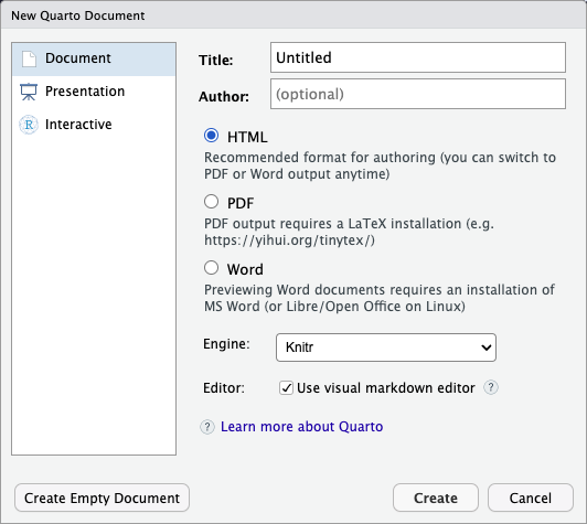
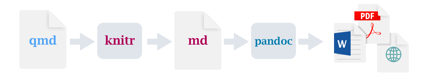
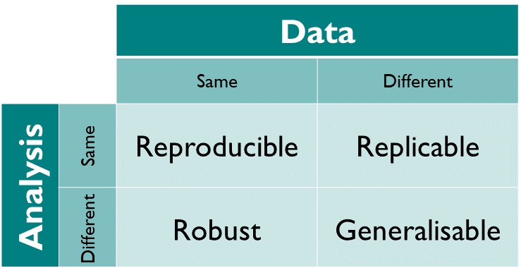
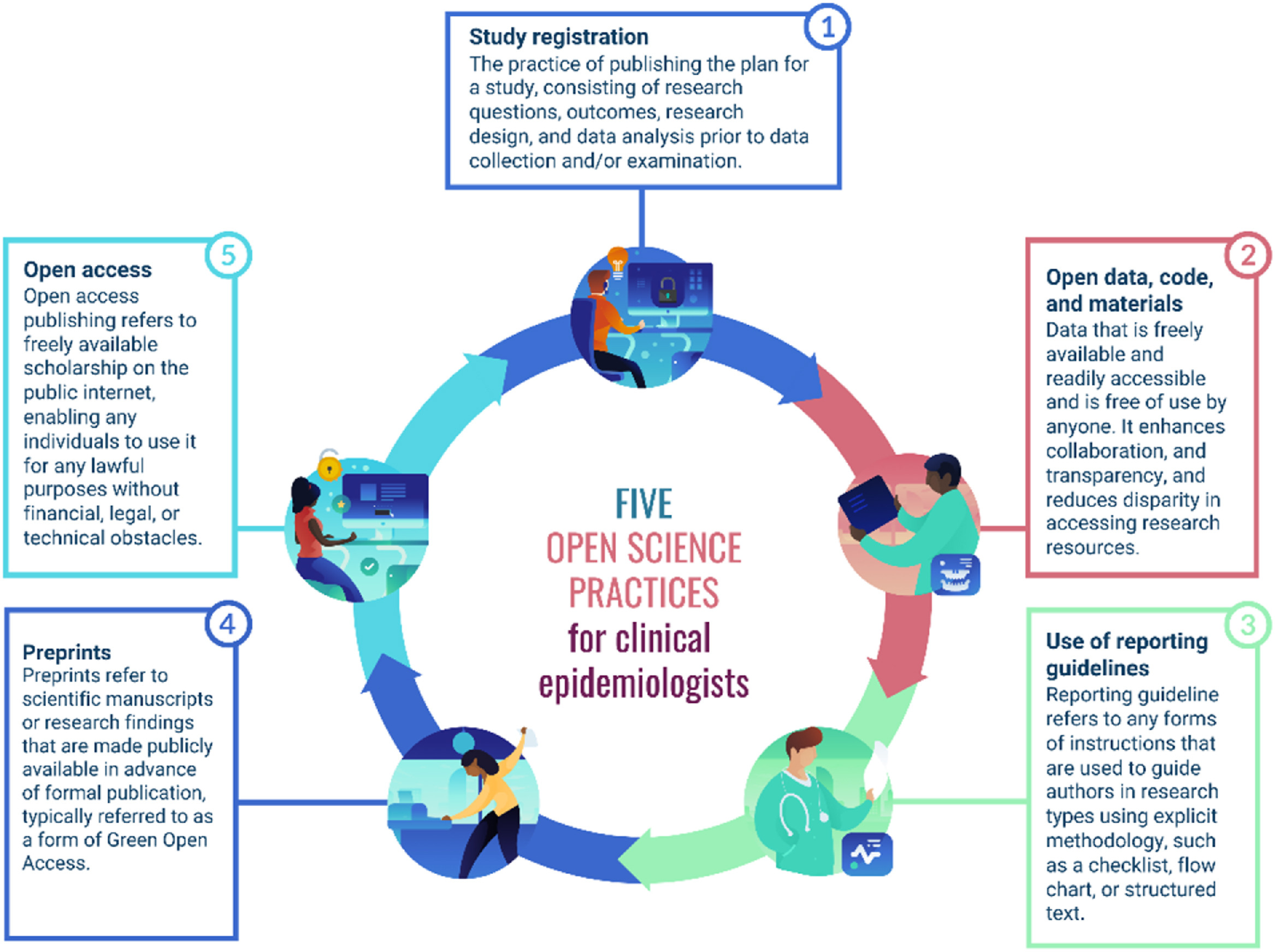 Image source:Key
challenges in epidemiology: embracing open science
Image source:Key
challenges in epidemiology: embracing open science


 These tables can be linked to each other when a field in one table can
be matched to a field in another table. To enable this one column in
each table is identified as a primary key. A primary key, often
designated as PK, is one attribute of an entity that distinguishes it
from the other entities (or records) in your table. The primary key must
be unique for each row for this to work. A common way to create a
primary key in a table is to make an ‘id’ field that contains an
auto-generated integer that increases by 1 for each new record. This
will ensure that your primary key is unique.
These tables can be linked to each other when a field in one table can
be matched to a field in another table. To enable this one column in
each table is identified as a primary key. A primary key, often
designated as PK, is one attribute of an entity that distinguishes it
from the other entities (or records) in your table. The primary key must
be unique for each row for this to work. A common way to create a
primary key in a table is to make an ‘id’ field that contains an
auto-generated integer that increases by 1 for each new record. This
will ensure that your primary key is unique.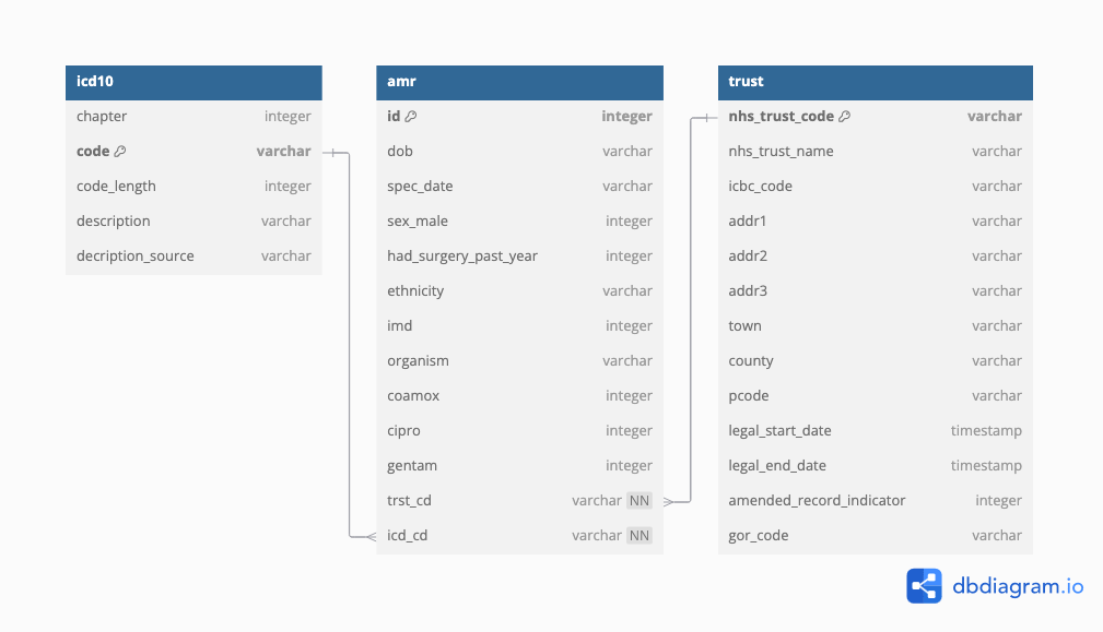 Relationships between entities and their attributes are represented by
lines linking them together. For example, the line linking amr and trust
is interpreted as follows: The ‘amr’ entity is related to the ‘trust’
entity through the attributes ‘trst_cd’ and ‘nhs_trust_code’
respectively.
Relationships between entities and their attributes are represented by
lines linking them together. For example, the line linking amr and trust
is interpreted as follows: The ‘amr’ entity is related to the ‘trust’
entity through the attributes ‘trst_cd’ and ‘nhs_trust_code’
respectively.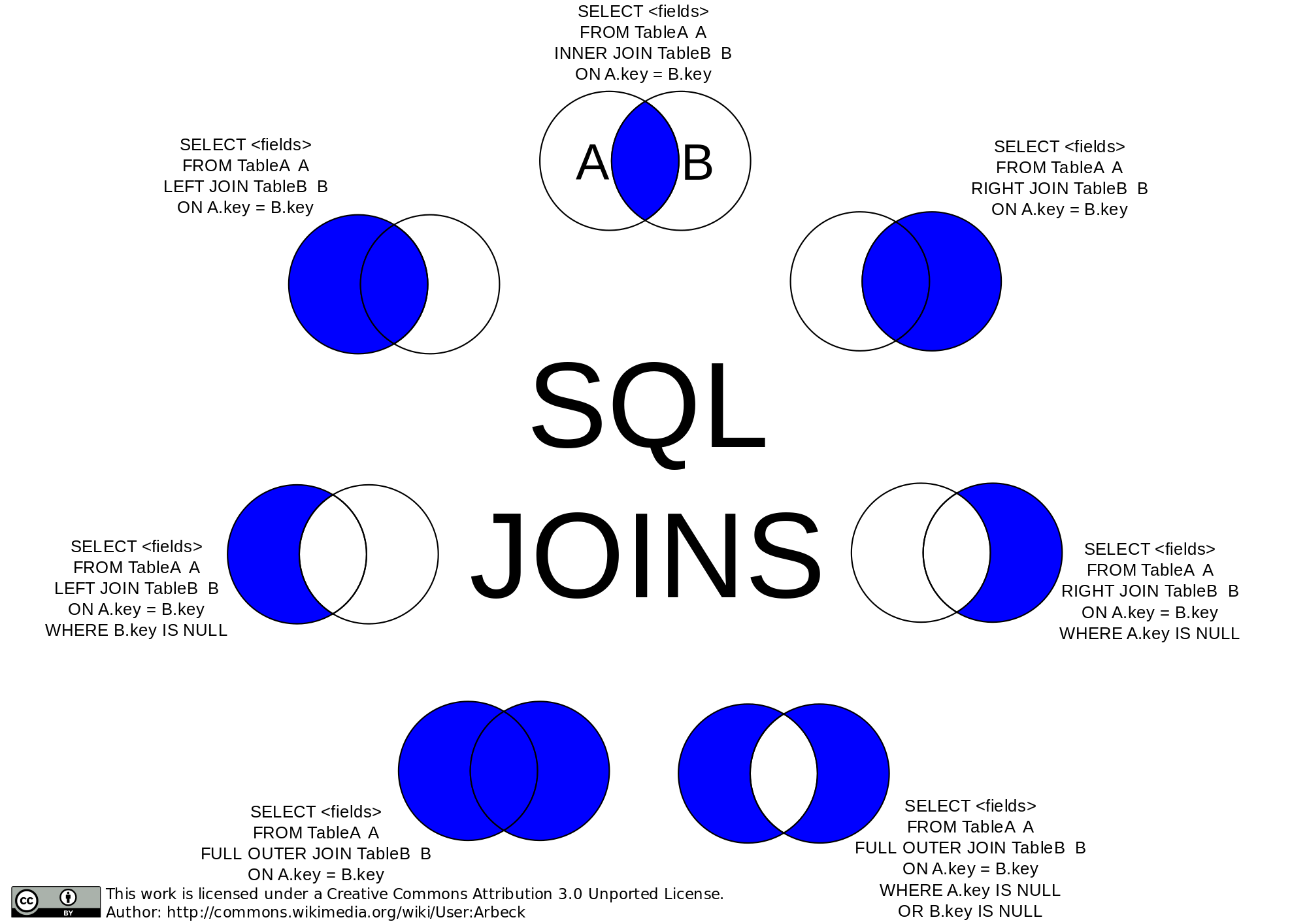
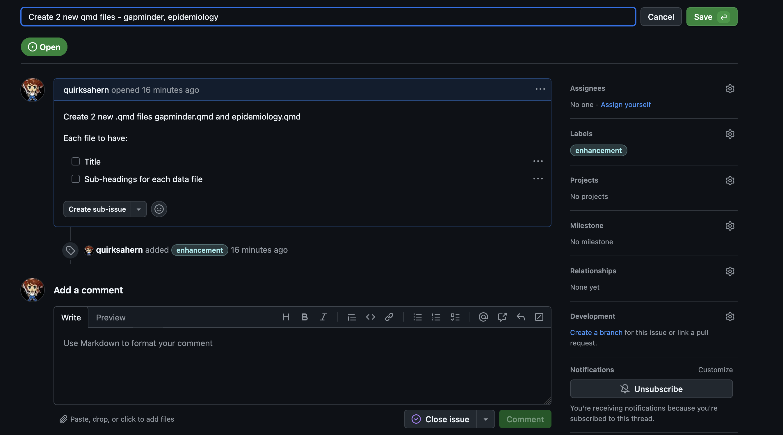
 You will
need to:
You will
need to: